Waitrose rolls out new brown sauce packaging – designed by a seven-year-old
Waitrose has worked with a seven-year-old boy on the redesign of its own-brand brown sauce packaging.
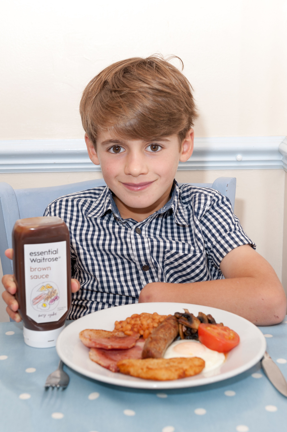
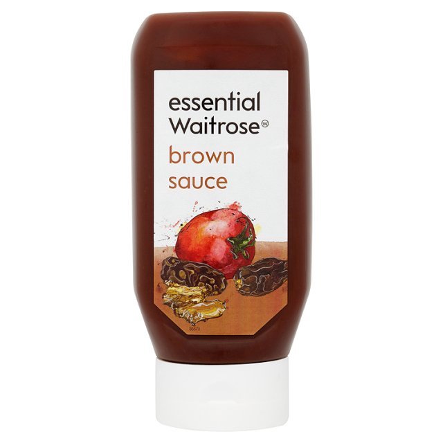
The limited-edition brown sauce bottle features an illustration of a full English breakfast drawn by Harry Deverill, who wrote to Waitrose managing director Mark Price saying he couldn’t understand the current drawing on the bottle.
In his letter Harry (six at the time), said he could redesign the bottles for Price who has taken him up on the offer.
Harry, who was rewarded with John Lewis vouchers says, ‘I love brown sauce, but didn’t know what the picture on the front of the bottle was.
‘I love eating eggs and bacon with brown sauce, so I thought I’d draw a new version. I’m so excited that my picture is on bottles in lots of Waitrose shops.’
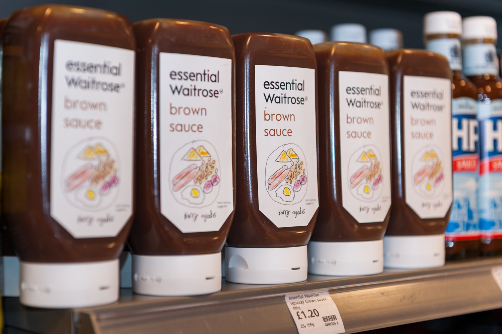
Harry’s bottles will be rolling out across most Waitrose shops where they will be on-shelf alongside the regular design.
The current Waitrose Essentials packaging design was created by the Waitrose in-house team and won the DBA Design Effectiveness Award Grand Prix in 2011.
Waitrose sauces buyer Jo Heywood says, ‘When we heard Harry’s offer and read his letter, we couldn’t resist. We love our customers to tell us what they think of products, and when they’re as creative as Harry, it’s a pleasure to be able to do something fun like this.’
Harry’s letter to Waitrose read as follows:
Dear Mark Price,
I am writing as the other morning I had Waitrose essential Brown Sauce with my bacon sandwiches. I asked Daddy what the picture is of on the label. Daddy didn’t know and neither do I. Please could you let me know. Mummy says I am good at drawing so if you would like me to draw a new picture for the label I would be happy to.
Kind regards, Harry Deverill, aged 6.
Read this next


Do you think if I write to them about the slightly questionable leading between ‘brown’ and ‘sauce’ they’ll let me fix it? 😉
Do you think if I write to Waitrose about the slightly questionable leading between ‘brown’ and ‘sauce’ they might let me fix it? 😉
Katie; probably yes but only if you get your mummy to write the letter for you.
Waitrose do tell… what did you pay the boy? Ahh, must be careful not to be so cynical.
What a very clever marketing activity.
First laugh of the day excellent Katie and Tim thanks!
PS What is the original illustration supposed to be?
That horrendous leading has now survived two iterations.
Mike – at a guess… a tomato, two dates and two tamarind pods (as found in their sauce no doubt).
The original illustration is a tomato, 2 dates and 2 Quality Street toffee wrappers balanced on a slightly tanned forearm.
My five year old could do better than that!
[Continue downwards until we reach embryo]…
Is that boy REALLY expected to eat that huge plate of food in front of him (covered in brown sauce, of course)?
I’m awaiting the birth of my granddaughter next week. Maybe she could have go the week after.
Next!
Yep that leading is nasty…
Having a close up image of both label designs to go with this article really would have made sense, don’t you think?!
ahhh waitrose essential range… including the essentials brioche & smoked salmon 😉
usvsth3m.com/post/51074663145/15-waitrose-essentials-that-are-anything-but
Dust Harry’s crayon box for prints………Mummy had an accomplice…
You do realise these labels are probably template based, so this label was the worse case scenario with the words set as there are no descenders or ascenders, which of course would clash if the leading was reduced (adjusting the leading per label was maybe not an option for some reason?)
You do realise these labels are template based, so this label was the worse case scenario with the words set as there are no descenders or ascenders, which of course would clash if the leading was reduced (adjusting the leading per label was maybe not an option for some reason?)
Designers with Children…
Find a Waitrose product for your child and get them writing.
Let’s start a movement.