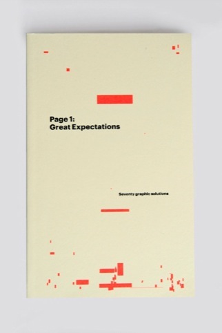
Page 1: Great Expectations
We all know you should never judge a book by its cover, but this first release from new publishing house GraphicDesign& asks you to judge it by its first page.

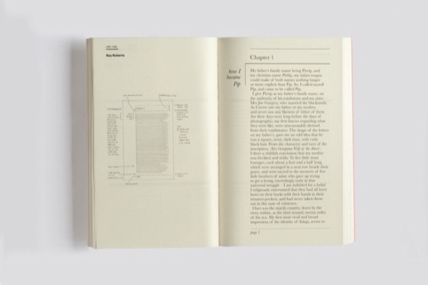
Paperback book Page 1: Great Expectations brings together 70 different typographic interpretations of the first page of Charles Dickens’ Great Expectations and is described by its publishers as ‘a typographic experiment of sorts’.

Erik Spiekermann, Tony Brook and Morag Myerscough are among those who have submitted first pages to the project.

Contributors were briefed to lay out the text in any way they wished, and were encouraged to play with the conventions of book typography. Each layout is accompanied by a short rationale from the designer.

The publishers say Great Expectations was chosen in part because the story directly references lettering – with protagonist Pip searching for clues about his family from letters inscribed on their gravestones.

The book’s cover, meanwhile, features fluorescent ink representing the footprint and position of the page number (1) as positioned by all the contributors. The publishers say, ‘It’s a completely random design over which we had little control, but we were very happy with the outcome.’
Page 1 is published by GraphicDesign& priced at £12.50. For more information and to order a copy, visit www.graphicdesignand.com
-
Post a comment


