Praline’s geometric branding for the UK–Russia Year of Culture 2014
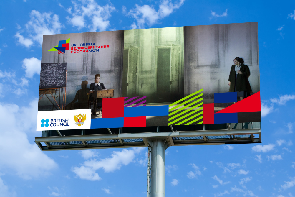
Praline has created the branding for the UK–Russia Year of Culture 2014, working with Moscow-based consultancy IMA to create a visual identity system using geometric shapes extracted from the UK and Russian flags.
The UK–Russia Year of Culture 2014 programme is organised by the British Council and features an exchange of cultural projects across Russia from the UK, as well as a showcase of Russian cultural projects in the UK throughout this year.
Exhibitions include the Golden Age of the Russian Avant-Garde at Moscow Museum and Exhibition Association Manege, curated by British film director Peter Greenaway.
The identity’s pattern of multicoloured shapes draws its colour palette from the flags of the UK and Russia, and can be taken apart and modified depending on its different applications.
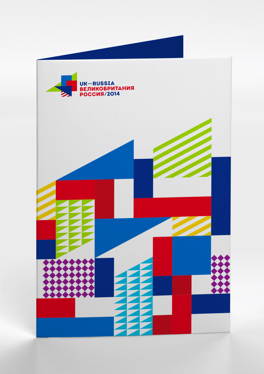
Additional colours were added to the branding to ‘reflect the diverse cultural events of both countries’, according to Praline.
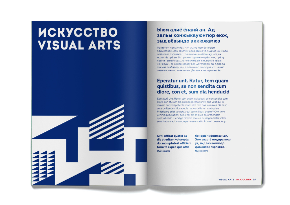
The logotype uses a custom typeface used in Roman and Cyrillic.
Praline was appointed to the project by the British Council, having pitched for the work in July last year.
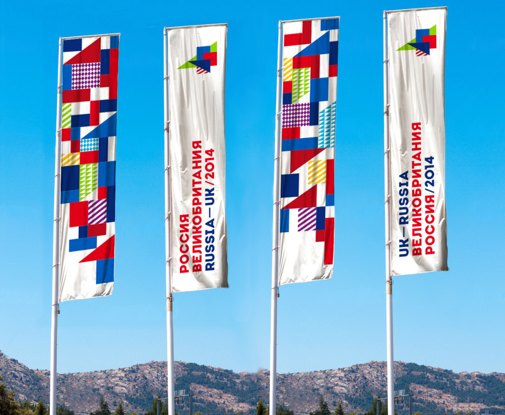
‘The strength of the UK–Russia design is an identity which can adapt to all formats and applications’, says Praline.
‘It can be elegant and subtle or expressive and playful. It successfully communicates the energy and positiveness of this exciting Year of Culture.’
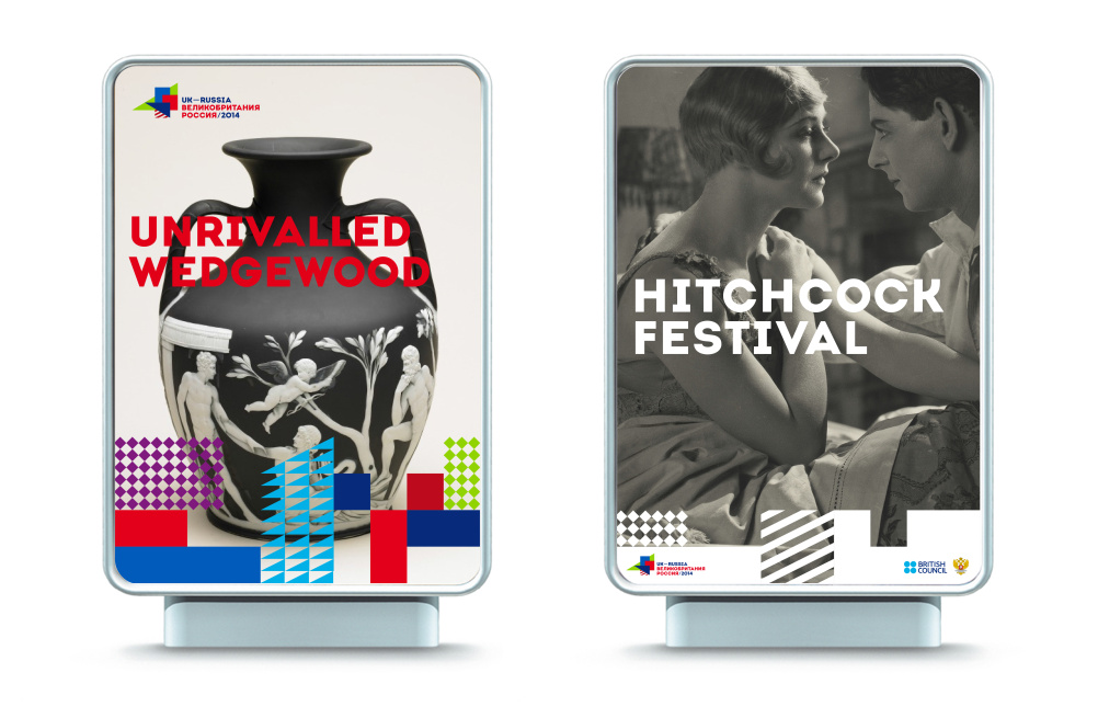
The branding is shown across all promotional materials, as well as on individual materials for the exhibitions taking place as part of the programme and on the website, www.ukrussia2014.ru
UK–Russia Year of Culture will culminate with an exhibition at the Science Museum London about Russian space exploration.


Speechless – and not in a good way!