Frank, Bright & Abel’s ‘otherworldly’ identity for £10 million Longitude Prize
Frank, Bright & Abel has created the identity for the Longitude Prize – a challenge that will award £10 million to a team that can solve one of the most pressing issues of the 21st century.
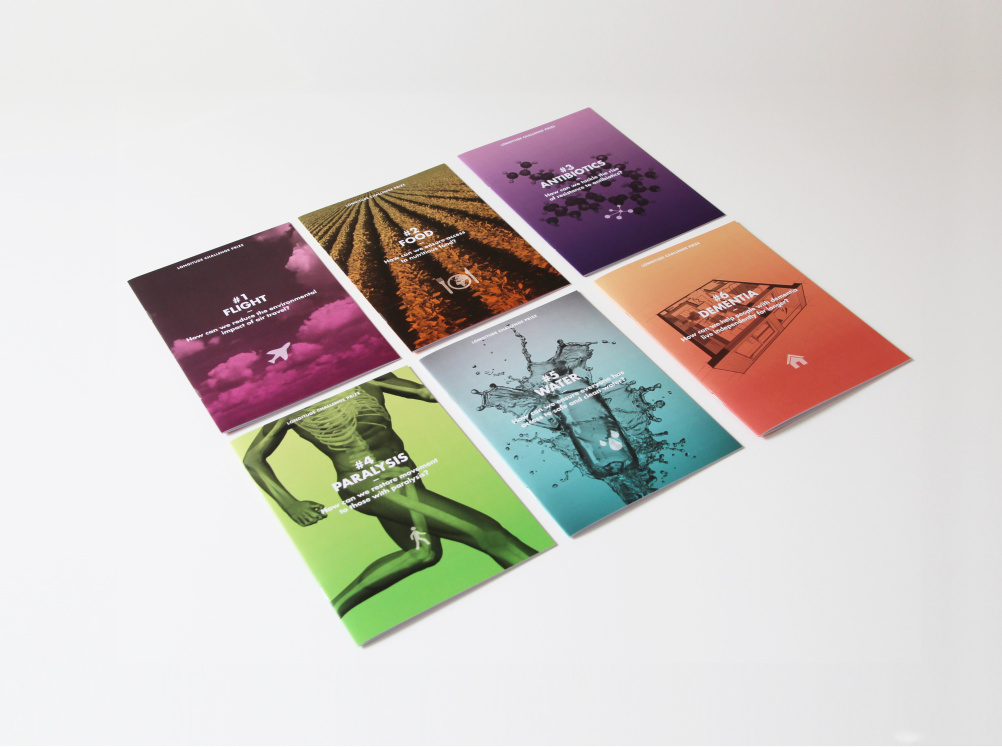
The topic to be solved will be decided in June after an online public vote, which will select whether issues around flight, paralysis, antibiotics, water, food or dementia are to be tackled.
The prize has been relaunched by UK innovation foundation Nesta for 2014 to mark the 300th anniversary of the original Longitude Act, which in 1714 offered £20,000 to the person who could find a way to accurate measure the earth’s longitude, solving problems around nautical navigation, and as such, helping global travel and trade.
Frank, Bright & Abel was appointed by Nesta late last year following a credentials pitch to create the visual identity, messaging and print collateral for the prize.
The consultancy was tasked with designing a look that ‘would capture the spirit’ of the initiative, that could appeal to the scientific community, the corporate world that could sponsor it, and the public who will be voting online on the topic to be tackled,
The website was designed by Numiko in conjunction with Nesta.
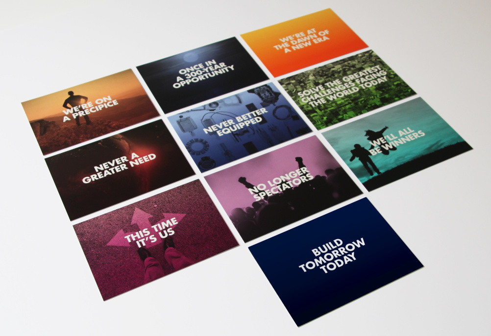
Rebecca Price, partner at Frank, Bright & Abel, says, ‘We started with the idea of messaging, and wrote something very anthem-like: “play a part and benefit from building the world of tomorrow for today”. It uses a verb so the word at the beginning of the message can change’.
Each of the different challenges the public is being asked to vote on is differentiated by a unique colour and graphic, such as a simple figure for the ‘paralysis’ strand and droplets for ‘water’.
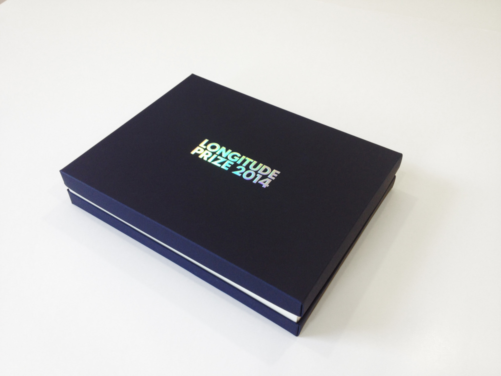
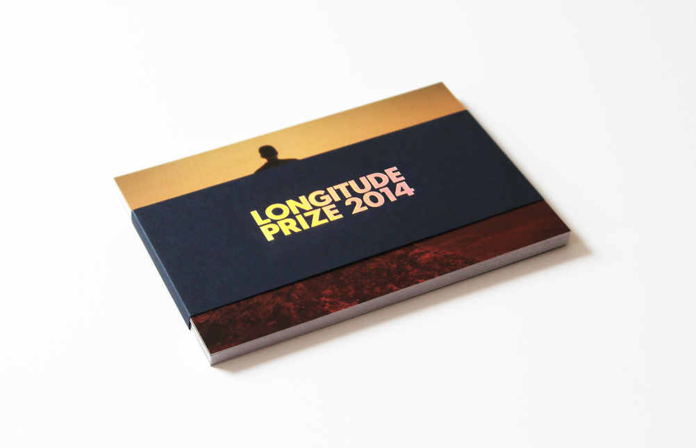
The word-mark uses a multi-coloured gradient, which Frank, Bright & Abel developed from a visit to Kielder observatory in Northumberland, where it saw an image of the sunset on Mars.

‘What struck us about the image was that it looks familiar but also not – that otherworldliness really appealed’, says Price.
‘The original Longitude [Act] was about going beyond the stars – this is about going even further, so we wanted to reflect that in the colours and letterforms’.
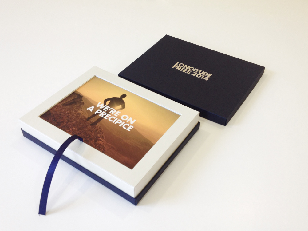
The typeface Futura is used across a series of messages in sound bites, displayed on postcards against a photograph backdrop, all treated with colours derived from the gradient on the main Longitude word mark.
John-Paul Sykes, Frank, Bright & Abel partner, says, ‘Futura seemed very apt. The printed materials all use really beautiful materials with an iridescent quality, and things like mirror foils that evoke an otherworldly quality and the dawn of a new era.
‘We wanted the presentation packs [used to pitch to sponsors] to feel really special’.
Read this next

-
Post a comment


