How the Guardian is rethinking its digital design language
The Guardian is this week relaunching its app, with new functionality and layout. The launch is part of a wider project in which the Guardian is rethinking its design language across all its digital platforms. We spoke to Guardian creative director Alex Breuer about how the Guardian’s new digital language was developed.

Design Week: What is the background to the new app launch?
Alex Breuer: I’ve been at the Guardian for about a year-and a half – prior to that I was digital design editor at The Times. When I arrived here it was clear that we were giving users completely different experiences – in terms of fidelity to the core Guardian brand – across all platforms. We have our Editions app, we had the old smartphone app, we had an Android app that was slightly different, we had desktop website and we had a mobile site worked on by a third party which also had a different design – all of which were vague interpretations of the original Berliner newspaper design. While the typography and key brand elements of the Berliner design are still core to what we do, it felt like there was a moment to evolve a new design language to serve our digital audience, many of whom aren’t familiar with the newspaper. The new design language had to be consistent, coherent and have fidelity of presentation and interaction across all our platforms.

DW: What are the key elements of this?
AB: Underlying all of this is a responsive grid system built around the column proportion taken from core image size we use across digital platforms. This substrate helps us enforce how we use space across headlines and pictures, which has always been a very key part of our brand identity. My feeling was that those kind of elements aren’t particular to a platform, so having consistency at that level gives familiarity, but we can then use respective platform technologies to apply different experiences.

DW: What is unique about the app experience?
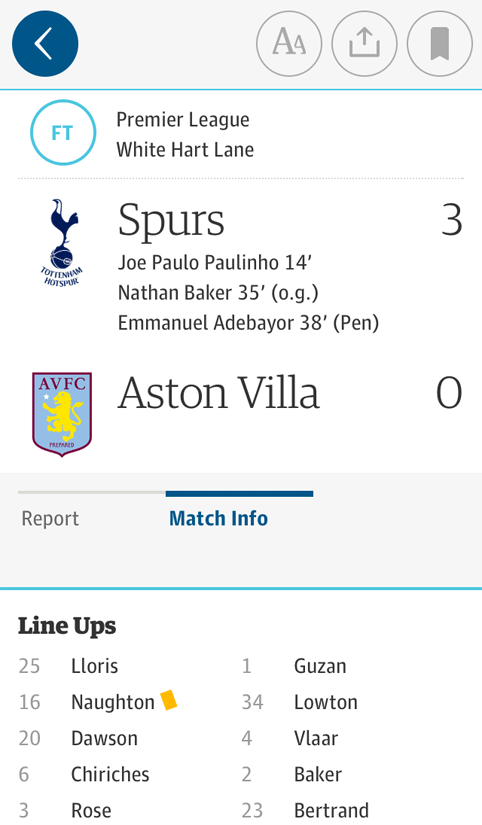
AB: It’s a more tactile experience, so the interactions demand that animations and transitions feel more graceful and elegant than web technology currently allows you to do. Live data graphics performance is much better and there is better image quality, so we focused a lot on image galleries. We did some really nice stuff in the Beta for European elections using live data. We can also look at bring things like football results to life – we’re building special functionality for the World Cup.

DW: How does the app’s personalisation element work?
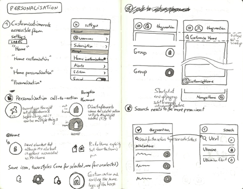
AB: We wanted to make personalisation very tactile as well – because app readers are our most engaged readers it was a really important issue. Our previous phone app’s UI had conformed very much to proscribed Apple guidelines, which are out of date as I think even Apple has realised there are people out there who have solved some of these problems. Their original guidelines were very clunky – you had to click away from screens and select things and drag & drop. We felt access to this personalisation was very important wherever you were in the app – whether its about following a writer or a particular story for updates or pinning sections to your homescreen.

DW: How does the app’s colour-coding element work?
AB: If you look at the tradition in a lot of news apps, many still refer back to the print view, which has a much more linear section structure. This always feels quite inward-looking – users don’t consume content based on departments in newspaper buildings. We discovered with the desktop website that people would sometimes click on story and be surprised at the content they got – for example they might click on a story headline and get a live-blog. As we were building this system we wanted to help readers navigate content by what they read. We have an overarching news colour palette, a features colour palette, one for multimedia and one for live content. This transfers to all the various touchpoints and platforms. In the past if you clicked on sports article everything would be green, but now for onward links we’re using the livery of that type of article, so you can quite quickly move to comment pieces for example. This means people can much more successfully navigate the story arcs we have and discover what they want. We know digital journalism will have to change form; there might be stories that are just based on a piece of interactive graphic, or some might be gallery-based or live-blogged. One of the things about the colour language we’re building is that we’re building spaces to really evolve those forms and bring them to life.

DW: How is the system built?
AB: We don’t have fixed templates for what we do – the content comes from an elegant tool in the CMS. Layouts across articles and pages can vary across the day and that will be an editing decision. We can art-direct article pages with different images uses for example. Whereas in past you might have had four front-page options, now we have a system that gives editors control over presentation – and now we’re going to have designers on the desk helping them to create these pages.

DW: What is the structure of the design team?
AB: We have tight composite teams of programme managers, designers, UX people, developers and editors, who all sit and work together. While we have overarching timelines it’s important to allow that team to build hypotheses and work without needing to go up and down a complex management chain. The old waterfall structure, where editors would say, ‘we want this’, designers would design it and developers would build it – it takes years and invariably you don’t discover problems soon enough.

DW: How did you bring users into the development process?
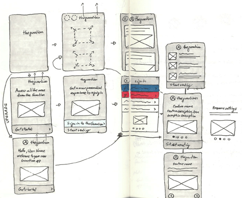
AB: Even from early stages before we committed any code we built wireframes and flats – we have a great UX and testing lab here, led by Nick Haley. We had three very different initial takes: one which was completely socially driven, where we took cues from how people were responding to content that was out there; one which imposed a hierarchy led by our open journalistic ethos and one which looked at that fact that there are multiple news sources out there, but people come to the Guardian for our particular take – so what if we dealt with stories as particular packages that lead people through the arc of a story? We wanted to nail whether any of these radical concepts were right. The thing that came out of that was that a quick browsable app combined with that authorial story arc and social cues is what people want. After that initial wireframing we went very quickly to rough prototypes and when we had a Beta version we opened up access to our most engaged users to let them play with it.

DW: Was there much change from Beta to the final version?
AB: We learned a huge amount that influenced the design and structure. Getting the balance right between beautiful presentation and story density was one of the key issues which we did a lot of work on. People are used to scanning lists and RSS feeds and that offers a certain degree of speed, but you sacrifice a great deal of identity and differentiation between content.

DW: Are there further developments planned?
AB: Very much so – one of fundamental ways in which this project is different is that previously there’s been a tendency to build something and let it sit there for a while. With this process we’re already planning future releases. We had a whole range of extra functionality that didn’t make it into initial release but is being developed for the next six months or so. There will be some updates that will bring to life the UI in ways that will make people understand why we’ve done some of the things we’ve done.


qbteruavgcw5144
longchamp en bandouliere air jordan 12 low longchamp racing results air jordan 5 lace lock air jordan 11 concord news air jordan 2014 black white air jordan 12 taxi low longchamp pink air jordan 14 black online longchamp air jordan 11 size 7-5 air jordan gamma hydroxy cream sac soldes longchamp air jordan 5 grape outfit sac longchamp pliage solde air jordan 14 retro gs air jordan 4 release history air jordan 3 store air jordan 11 og colorways longchamp longchamp longchamp http://www.moreairjordan.com/Cheap-Air-Jordan-5/Cheap-429489-003-Air-Jordan-Prime-5-Black-Varsity-Red-Metallic-Silver-Shoes-Outlet-Sale-Online-B75.html air jordan 3 retro air jordan 6 release date air jordan 2014 370z roadster air jordan 2014 signature shoe air jordan 6 carmine gs air jordan 5 2006 air jordan 11 white courses hippiques longchamps air jordan 12 playoff tumblr
wzoqcnqwngg1313
boutique sac longchamp air jordan 7 high heels air jordan 5 low air jordan 13 bred 2013 sac longchamp planète air jordan 4 sz 10-5 air jordan 4 fear pack air jordan 5 oreo preorder air jordan 8 quarts equals location chalet saint francois longchamp ballerine longchamp air jordan 14 slippers white taille sac longchamp pliage air jordan 9 top quality prix longchamps air jordan 5 army green longchamp le pliage online shop http://www.moreairjordan.com/Cheap-Air-Jordan-3/Cheap-398613-102-Air-Jordan-3-Anniversary-(-White-Silver-)-Online-B26.html cheap air jordan 10 air jordan 2 longchamps sac a main air jordan 14 obsidian audio porte feuille longchamp air jordan 5 all models air jordan 1 97 air jordan 11 bred online air jordan 4 yeezy 2 sac homme longchamps air jordan 11 low snakeskin air jordan 12 retro nubuck
msbkahzumse9362
Cheap Nike Air Jordan 14 air jordan gamma 0-3 longchamp paris online air jordan 3 flips air jordan 5 3lab5 9-5 longchamp mini Nobis The Yatsey air jordan 2014 300 chrysler longchamp xlight air jordan 6 lakers black authentic air jordan 9 longchamp online sale air jordan 4 spike lee air jordan 14 size 7 air jordan gamma 0% apr air jordan 5 eminem lyrics http://www.moreairjordan.com/Cheap-Air-Jordan-7/Cheap-543560-225-Air-Jordan-7-Filbert-(-Filbert-Natural-Obsidian-White-)-Online-B95.html longchamp rose Louis Vuitton Uk http://www.moreairjordan.com/Cheap-Air-Jordan-4/Cheap-308497-002-Air-Jordan-4-Black-Cat-Online-B46.html air jordan 13 flints sac longchamp noir pas cher air jordan 5 inspiration board http://www.moreairjordan.com/Cheap-Air-Jordan-10/Cheap-310805-100-Air-Jordan-Retro-10-(X)-Chicago-Bulls-2012-(-White-Varsity-Red-Black-)-Online-B126.html air jordan 2 5s otterbox air jordan 13 maroon grey air jordan 3 eminem encore parapluie longchamp prix air jordan 13 altitude ebay sac pliable longchamps
onugrpeepbe4510
http://www.moreairjordan.com/Cheap-Air-Jordan-1/Cheap-Air-Jordan-1-Retro-High-Men-e2-80-99s-Basketball-Shoes-(-Black-Blue-)-Online-B11.html air jordan 1 id air jordan 6 world cup air jordan 3 black joker air jordan 2014 zx10r exhaust air jordan 1 usa spanclassic air jordan 13 air jordan 7 bordeaux kids http://www.moreairjordan.com/Cheap-Air-Jordan-CDP/Cheap-338151-991-Air-Jordan-8-15-Countdown-Package-Shoes-Online-B239.html air jordan 14 graphite chartreuse Cheap Air Jordan 1 Retro High Og air jordan 14 size 10-5 longchamp scarf air jordan 9 volt batteries air jordan 6 retro white air jordan 3 custom air jordan 1 mid georgetown prix sac à main longchamp air jordan 14 xiv retro air jordan 14 ginger zee air jordan 11 2013 release air jordan 5 slides http://www.moreairjordan.com/Cheap-Air-Jordan-4/Cheap-308497-105-Air-Jordan-Retro-4-(-Military-Blue-White-Neutral-Grey-)-Online-B40.html nike free run 5.0 womens uk air jordan 13 embroidery air jordan 9 barons gs air jordan 6 2000 craigslist air jordan 4 cavs store air jordan 3 grey air jordan 14 unc basketball
cassegrain longchamp longchamps pas chere solde longchamp webcam saint francois longchamp sacs pliage longchamps
Timberland Deck Shoes Timberland Boots Outlet Timberland Boat Shoes cheap nike free run 2 Nike Free Run outlet
Duvetica Cobra Toms Patek Franklin Marshall
Nobis The Audrina Nobis The Anorak Nobis The Rosco Nobis The Kato Nobis The Lil Ky
enneigement st francois longchamp sac voyage cuir longchamp longchamp jeremy scott longchamp pochette longchamps sacs
Long cut off from the camera’s glare. Over the past two years there have been a handful of public appearances please well. And Paris Jackson.
air jordan 6 vi air jordan 4 cement tumblr air jordan 14 jd air jordan 11 og colorways air jordan 10 retro x air jordan 7 release dates air jordan 14 juillet 1789 air jordan 11 45 air jordan 11 concord wallpaper air jordan 14 buy
In current society, There are a lot more people like zentai suit. They have different way of getting the suits. A lot of people are introduced by friends or need it in special situation, Such as halloween or some special party. A couple of For all females which looks like a little plump. If you very happy with your own jugs in addition to really don’t mind shower up for stylish doll, Try that sweet Lolita gowns and even medieval Lolita. They want the ideal curves to cover your own redundant body. Cheap Zentai Suit
Britta experienced an unexplained trauma in her childhood during a celebration, About a man in a dinosaur costume. She decided to drop out of twelfth grade because she thought it would impress Radiohead.] After quitting school, She started vandalizing advertisements around the area where she grew up. During the vandalizing she became friends web-sites who liked to vandalize. lycra suit
That previously listed success through Beckii Cruel tend to be never the final connected with your girlfriend tale. Though, You could expect which she choose additional within entertainment market. Within April Cruel saw Japan in addition to produced a company referred to as that Cruel Angels, That includes a 18 year old People from france school scholar, Known through your friend step name Sarah Cruel, Faraway brought on by Lyons, And a 16 year old scholar from Portsmouth known through your partner step name because Gemma Cruel.Using the survey zentai costumes
The added attraction is the lines contributed by fashion retailers to advertise their products and online services. Certainly, Next time before shopping, Make sure to catch the most up to date the latest fashions on the top 10 Indian Fashion blogs. This official blog keeps their customer posted with updated news and reviews so you may to see, Select and buy from the latest range of established Indian fashion as well as footwear, Jewellery, Totes, Indo european wear, Space d cor etc. pvc catsuits zentai for sale
you may also like:
http://xn.wo.lt/redirect.php?url=http://www.organiclea.org.uk/wp-content/backup-0e37f/cache/ http://www.dokkagatebil.com/wp-trackback.php?p=445 http://datinglawn.com/index.php?dll=profile&sub=blogview&item_id=12177&item2_id=12915
L’ensemble des gens”zenta” Sont eux totalement librs de tous l’ensemble des rl’ensemble des sociaux. Il n a plus que la connection physique directe, Et c comme a qu ze sony ericssonntent libres, Avance the professeur Daibo.Reste qu not”zenta” Dans le but de la premire fois ne semble pas ais, Tant cette pratique est convey sexuellement, Notamment dans les milieux gays comme en attestent des sites globe qui vendent ce genre de tenues.Hanaka, Une jeune femme delaware 22 ans, Raconte ses premiers pas: “Quand j small, J fascine par les dominos de hros. The actual 13 ou 14 a good solidns, J essay de me fabriquer ma propre combinaison en cousant des bas clothing, Mais j promote arrt, En me disant que j en train de faire quelque chose de outrageous, Zentai Suit
But makeup, Cosmetic salons also add to your hair styling and make improved adjustments with your contemporary outfits. Beauty spas are yet other vastly journeyed places by woman. Beauty spas endow relaxing massage options that are moistures and nurtures once body. full bodysuits
Excellent things in life are NOT free, Nor are men’s suits. In fact quality men’s suits do not come cheap but if you can to spend a little more cash just to look like a million bucks, Then a quality suit comes recommended. Ofcourse, You’ll want to wear a good suit in order to appear like the perfect gentleman and NOT a country bumpkin. zentai costumes
The patent leather loafer is a sharp looking shoe may fit even the most formal occasion. L Amour shoes will likely make babies look like a fashion plate. Their crib shoes for girls are everyday materials stylish baby shoes available. Prickly pear cactus is used in making the right water proof paint for homes. The process originated in Mexican rural areas and is probably pre Columbian. It was mostly used in the 16th to 18th centuries for painting like a professional churches and convents and the smooth paint gave a shiny, Silk like finish if white of eggs were added to a combination, Expresses Ms. spiderman costumes
you may also like:
http://www.organiclea.org.uk/wp-content/backup-0e37f/cache/ https://longreachhighreach.com/info.phtml?a%5B%5D=%3Ca+href%3Dhttp%3A%2F%2Fwww.pointbeachinteriorsnj.com%2Fwp-content%2Fuploads%2Fcache%2F%3EKimberly+girls+halloween+Cos%3C%2Fa%3E http://www.hrbzszy.com/plus/guestbook.php