The design winners at D&AD
This year D&AD has awarded 56 Black and Yellow pencils, 26 of them going to projects in design categories. There are four design Black Pencils and 22 Yellow Pencils. We take a look at this year’s design pencil winners.
Black Pencil

NS/ProRail – Improving Safety and Comfort on Train Platforms, by STBY Amsterdam and Edenspiekermann
Dutch railway service NS wanted to improve the transfer service on railway platforms. STBY Amsterdam and Edenspiekermann created an LED strip, placed above the platform, that tells passengers all they need to know.
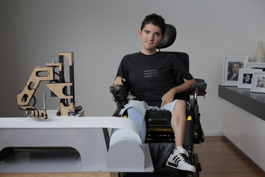
The Most Powerful Arm, by Finch with Havas and Reactive Sydney
To raise awareness of Duchenne Muscular Dystrophy, the agencies built the Most Powerful Arm. This uses Facebook to sign signatures onto a petition in the handwriting of Jacob Lancaster, a young DMD sufferer who can no longer write.

CSPD 2012 Annual Report, by WAX Partnership
When designing the annual report for the Calgary Society for Persons with Disabilities, WAX Partnership decided to make it hard to read, to highlight the fact that ‘being handicapped is hard’. The report is bound with a single staple and features ‘stark’ photography and ‘honest’ writing.
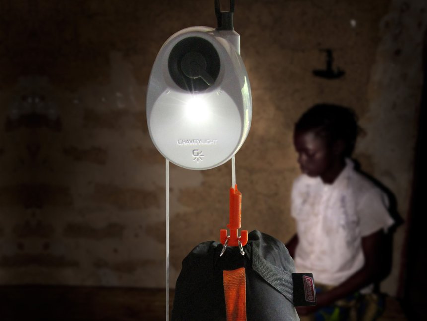
GravityLight, by therefore
A winner in the White Pencil category, GravityLight is an LED lamp powered by gravity. A weight drops slowly under the force of gravity, creating 30 minutes of charge for the lamp.
Yellow Pencil

Mac Pro, by Apple
Also shortlisted in this year’s Design Week Awards, the Mac Pro is built around a unified thermal core and features dual workstation-class graphics cards, Intel Xeon processors and ultra-fast flash storage.
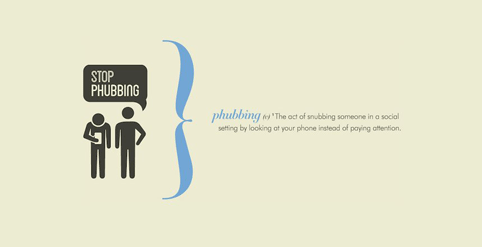
Phubbing: A Word is Born, by McCann Erickson Melbourne with writers John Mescall and Natasha Wood
A winner in the Writing for Design category, the Phubbing campaign saw a new word created for the Macquarie, Australia’s national dictionary, to remind people of its relevance.
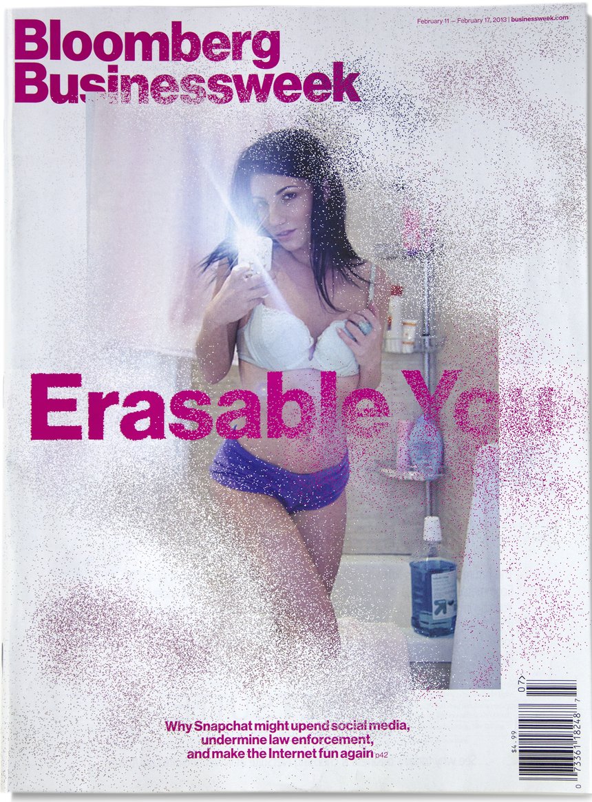
Bloomberg Businessweek 2013 Cover Series, by Richard Turley and Bloomberg Businessweek
The magazine was awarded for a selection of its 2013 covers. Former Bloomberg Businessweek creative director Richard Turley recently left the publication to join MTV.
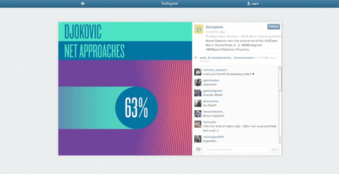
Datagrams, by Ogilvy & Mather New York
The Datagrams project, for US Open sponsor IBM, tells the story of the tournament through data.
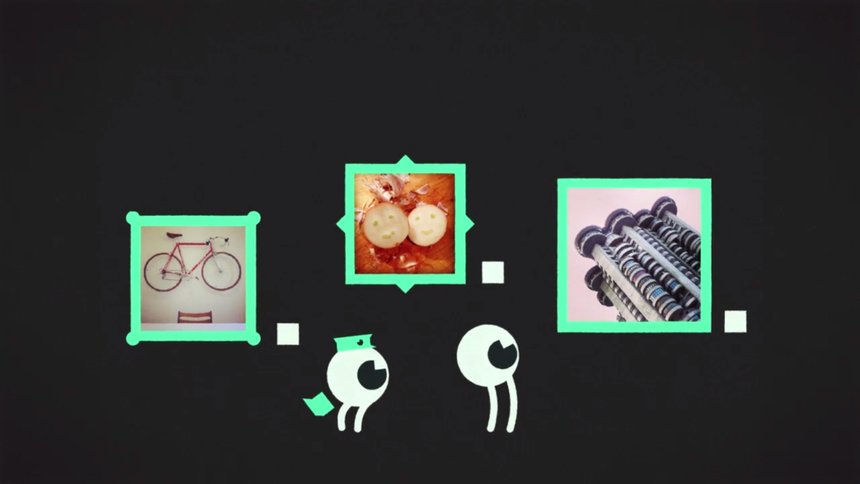
Social Visionaries, by Stinkdigital
The Social Visionaries project, for Ray-Ban, aims to use social media to view creativity in new ways.
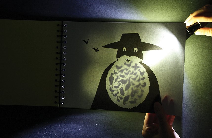
Hide & Eek!, by Hat-Trick Design
Hide & Eek!, by Hat-Trick Design and illustrator Rebecca Sutherland, is a book designed to be read under the bedcovers, with illustrations only revealing themselves by torchlight.
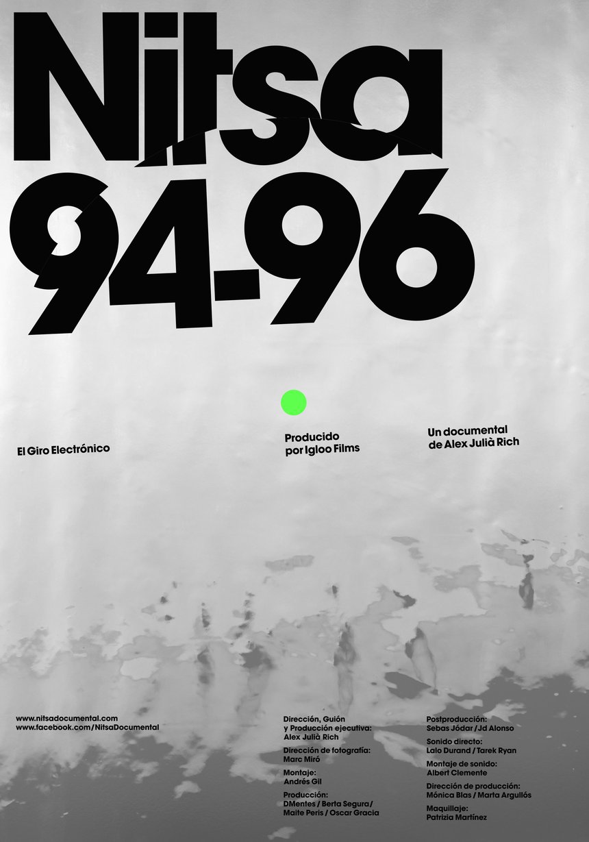
Nitsa 94/96: El Giro Electrónico, by Mucho
Mucho created a limited-edition poster for ‘Nitsa 94/96: El giro electrónico’, a documentary that chronicles the beginnings of Nitsa, an iconic nightclub in Barcelona.
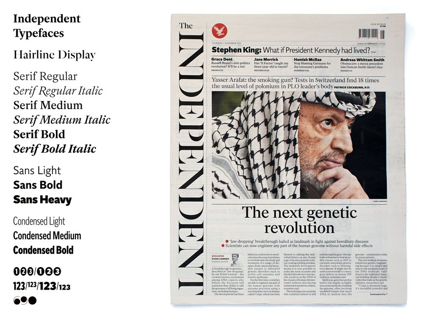
The Independent Newspaper Fonts, by A2/SW/HK
For the recent redesign of the Independent, by the newspaper’s in-house team with Matt Willey, A2/SW/HK created a new font family – Indy Sans, Indy Serif and Indy Hairline – which appears throughout.
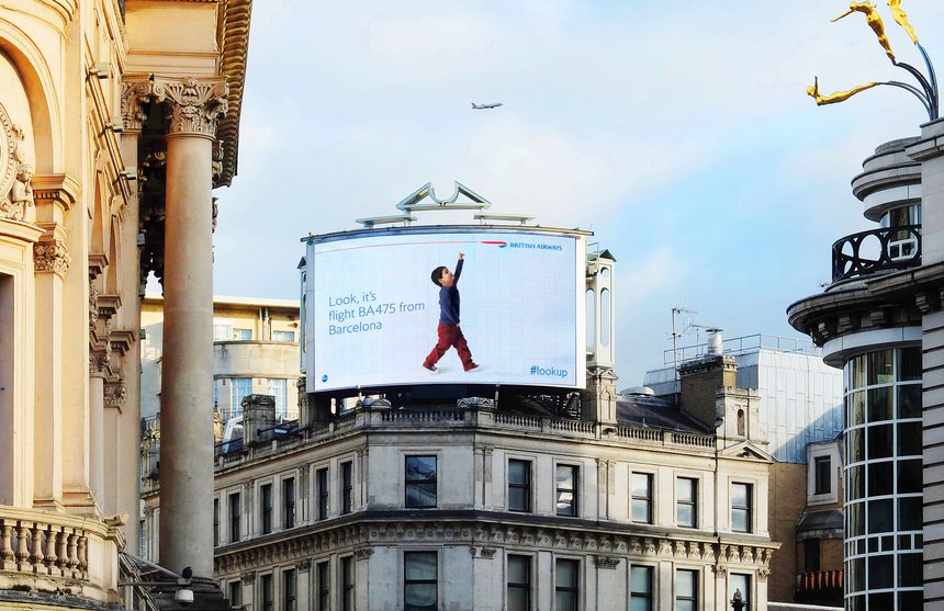
Magic of Flying, by OgilvyOne Worldwide London
OgilvyOne built the world’s first billboards that reacted to British Airways planes flying overhead. Using an ADSB antenna, the system reads every aircraft’s transponder data within a 200km radius. The ads displayed each plane’s flight number and the location of its departure.
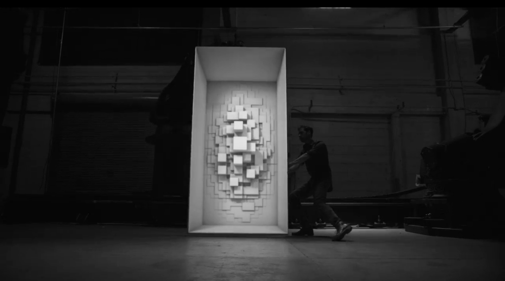
Box, by Bot & Dolly
Box combines animation, robotics and projection mapping and brings CG elements into the human world, enabling a live performer to interact with them.
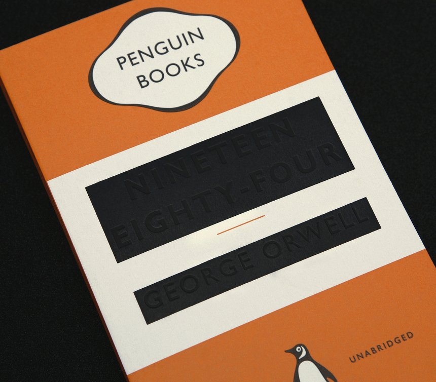
Nineteen Eighty-Four, by David Pearson and Jim Stoddart
Also shortlisted in this year’s Design Week Awards, the 1984 cover, uses blind debossed elements in a two-colour design.

Heart of the Arctic, by Jam3
Heart of the Arctic is a parallax website for the Royal Canadian Mint, designed to make coin collecting and history irresistible to children.
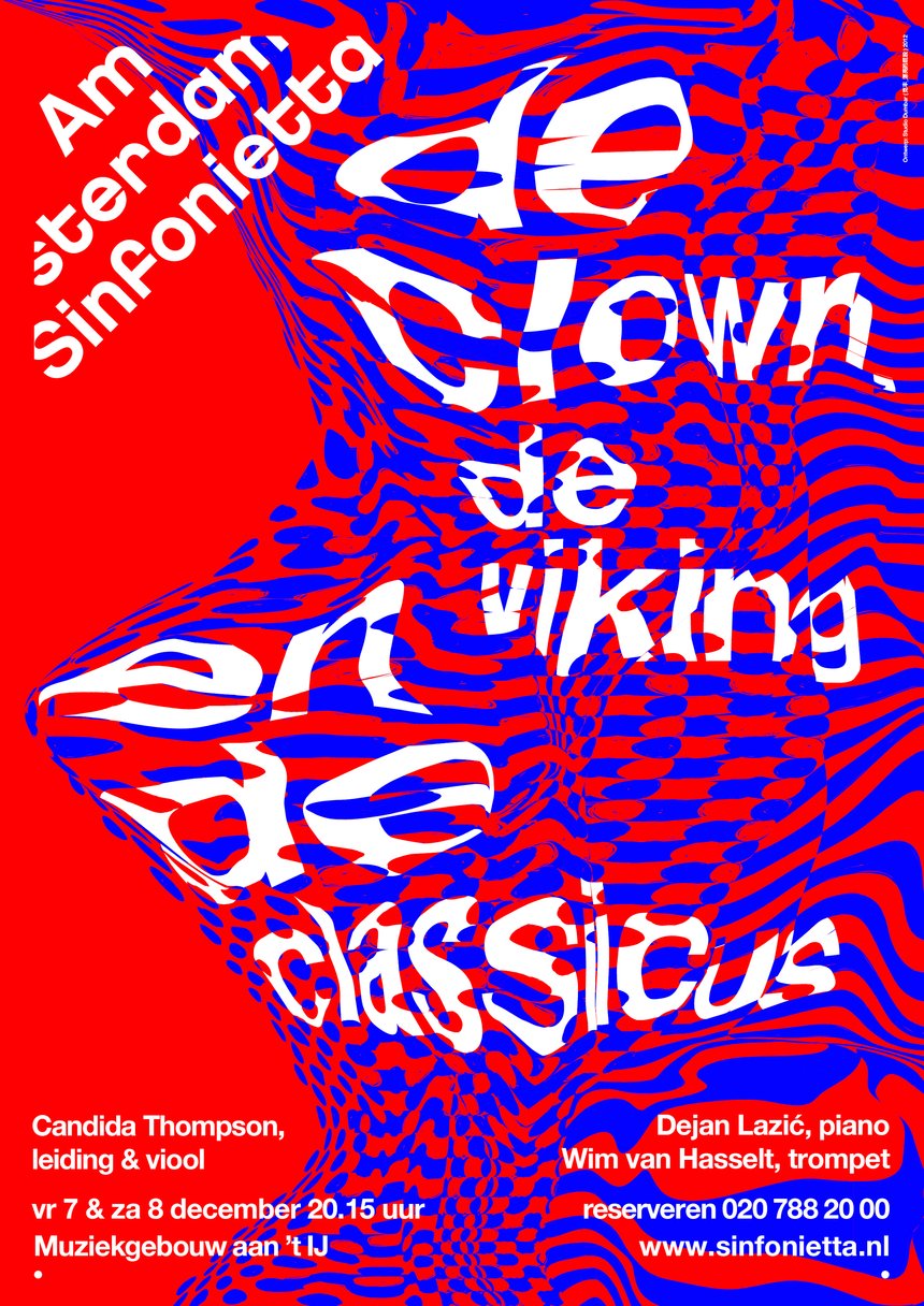
Amsterdam Sinfonietta, by Studio Dumbar
The Amsterdan Sinfonietta promotional posters are designed to reflect the musical themes of each of the sinfonietta’s performances.
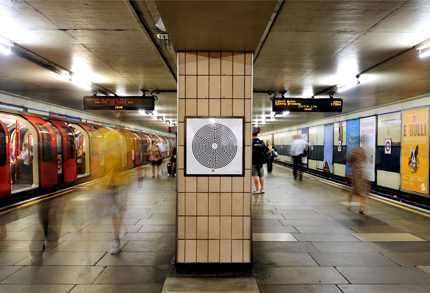
Labyrinth by Mark Wallinger, by Rose
Labyrinth is a series of artworks created by Mark Wallinger for Transport for London’s Art on the Underground scheme. Rose worked both to help realise the artworks themselves and to develop branding for the project. The project was also shortlisted in this year’s Design Week Awards.
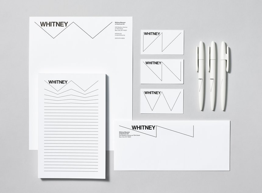
Whitney Museum of American Art Identity, by Experimental Jetset
Dutch consultancy Experimental Jetset has created a new identity for the Whitney Museum of American Art in New York, which is based around the concept of ‘a responsive W’.
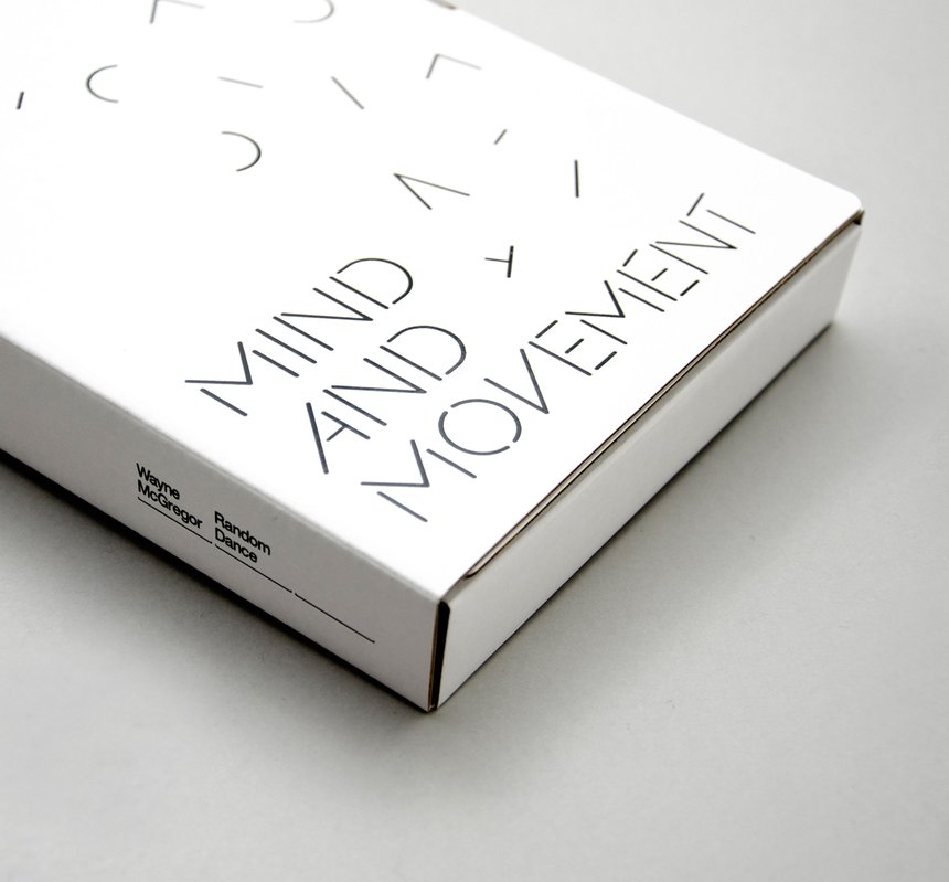
Mind and Movement, by Magpie Studio
Shortlisted twice in this year’s Design Week Awards, the Mind and Movement project aims to engage students with choreographer Wayne McGregor’s teaching methods and encourage them to deconstruct the way they think about movement.

Pierre Hermé Paris, by Nippon Design Centre
Hand-moulded packages were created to packaging Ispahan, a macaroon that is one of Pierre Hermé’s most well-known pastries.

Dill – The Restaurant, by INGO
The Dill restaurant was set up in Sweden to promote discount supermarket chain Lidl. All food used in the restaurant was bought at Lidl.

Tamabi, by MR_DESIGN
TAMABI is a nickname for Tama Art University in Japan. MR_DESIGN created a series of advertisements which incorporate the university’s slogan ‘MADE BY HANDS’.
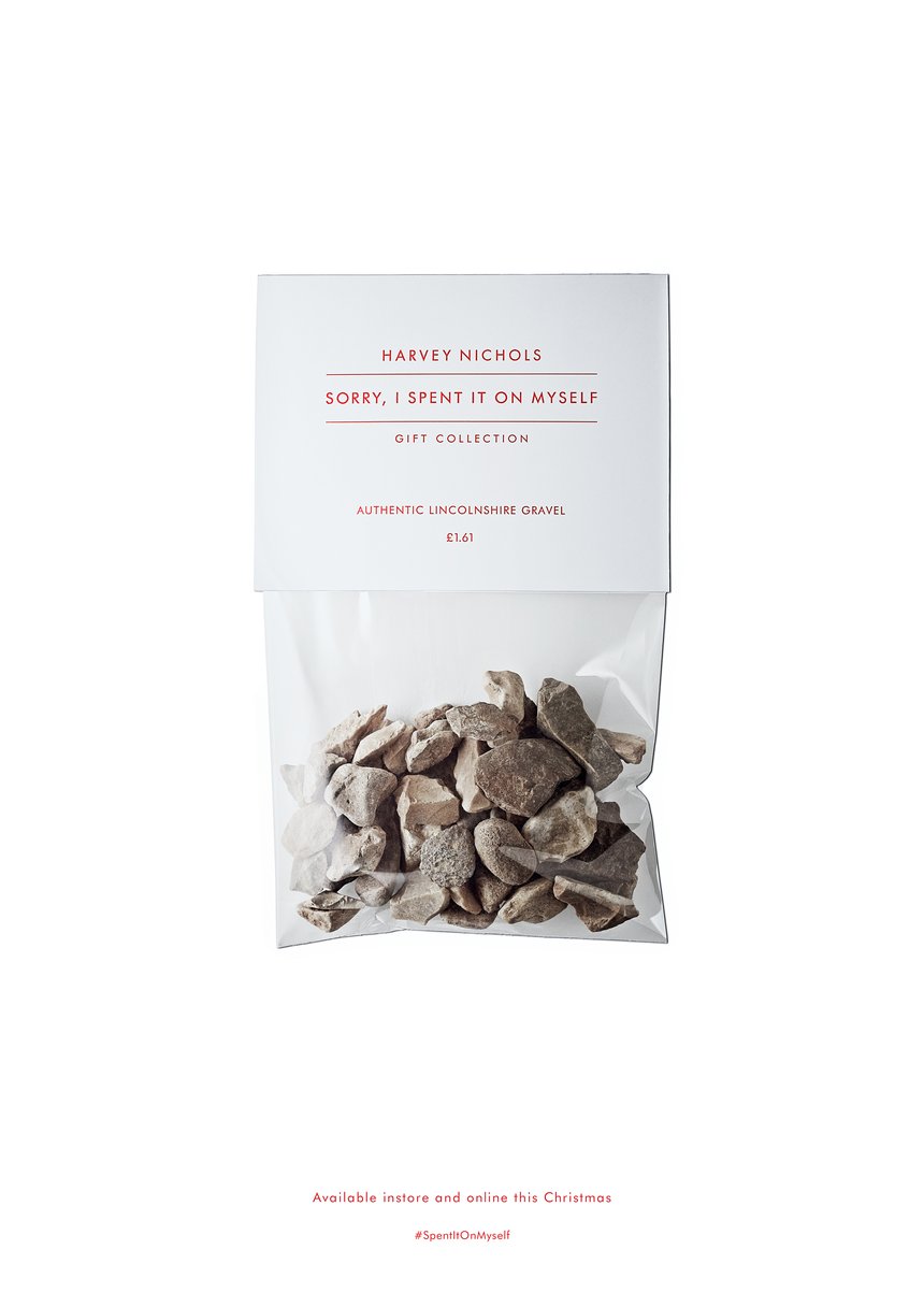
Sorry, I Spent It On Myself, by adam&eveDDB
Adam&eveDDB and Harvey Nichols invented a new line of products for the festive season; the Sorry I Spent It On Myself Gift Collection.
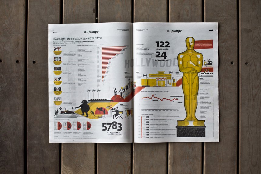
Series of Moskovskiye Novosti newspapers, by Moskovskiye Novosti
A series of issues daily Russian-language newspaper Moskovskiye Novosti.

The Beautiful Black List, by Dentsu Tokyo
Celebrating its 50th anniversary, D&AD exhibited successive Black Pencil works together for the first time. Dentus named these collectively as the ‘Black List’ and executed the exhibition’s design.
––––––––––
You can see full case studies of all the awards winners at www.dandad.org.
Read this next

-
Post a comment


