After 30 days of previews, Yahoo launches new logo
Yahoo has unveiled its new identity, after showing 30 variations of its logo before launching.
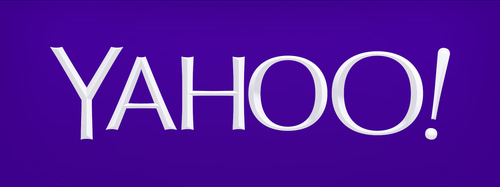
The final Yahoo identity is different from any of the 30 iterations already shown, and features a bevelled 3D-style look.
It retains Yahoo’s purple brand colour and exclamation mark.
Yahoo chief executive Marissa Mayer says she developed the new logo over a weekend this summer, working with ‘logo design team’ Bob Stohrer, Marc DeBartolomeis, Russ Khaydarov, and intern Max Ma.
Mayer says, ‘On a personal level, I love brands, logos, color, design, and, most of all, Adobe Illustrator. I think it’s one of the most incredible software packages ever made. I’m not a pro, but I know enough to be dangerous.’
Yahoo chief marketing officer Kathy Savitt says, ‘We wanted a logo that stayed true to our roots (whimsical, purple, with an exclamation point) yet embraced the evolution of our products.’
Savitt says the new identity will be rolled out internationally across all Yahoo’s touchpoints.
As well as launching a new identity, Yahoo has also rolled out new website designs across its networks, including Sports, Movies and other platforms.


I’m glad someone had the utters to go for this solution. Much better than most of the flat stuff going around lately.
Terrible project, terrible result. There’s not an ounce of personality coming through.
They wanted to stay true to their roots, how does this achieve this in any way?
Shame to waste an opportunity for a fresh start.
Why bother having 30 day build up when all we get is this anti-climactic evolution. Was positive the new branding was going to be a huge step change given all the build up. How wrong I was.
They only gave themselves 30 days to show the world how dull Yahoo! had become as a company. Now the rush is over they’ve got as long as they want. Well done guys, you can sit back an relax knowing this logo will do it in spades.
http://marissamayr.tumblr.com/post/60336044815/geeking-out-on-the-logo
“So, one weekend this summer, I rolled up my sleeves and dove into the trenches with our logo design team: Bob Stohrer, Marc DeBartolomeis, Russ Khaydarov, and our intern Max Ma.
We spent the majority of Saturday and Sunday designing the logo from start to finish, and we had a ton of fun”
So essentially a rebrand takes about 2 days of work. Crack on everyone.
I liked the 30 day warm-up idea.
But this as the reveal?
To quote http://marissamayr.tumblr.com/
“So, one weekend this summer, I rolled up my sleeves and dove into the trenches with our logo design team: Bob Stohrer, Marc DeBartolomeis, Russ Khaydarov, and our intern Max Ma.
We spent the majority of Saturday and Sunday designing the logo from start to finish, and we had a ton of fun”
So there you have it — from the horse mouth.
It takes 2 days to rebrand a $10b company.
And obviously — don’t do it in working hours, as it’s pretty much a worthless endeavour.
Deary me…
Couldn’t agree with Simon more. Enough column inches on this everyone now.
It’s terrible, we all know it. A CEO that knows a bit about Illustrator is a dangerous thing indeed.
Dare say I could have a crack at sorting out the shit-heap that is Yahoo – anyone fancy a couple of days work on it with me!!
I’m not sure I agree Simon, with a small team it does and can take about 2 days to create a “logo”. Also they spend a month creating and testing the other *cough crap cough* they released, which might have allude to it in the process. Rarely do I recall people praising a rebrand of a big brand. But truly ask yourself, when did the logo become the brand?
Also have to agree with Simon and Jason – can’t help but feel that Mayer’s comments simply belittled a raft of designers. Have explored this idea further – and the campaign as a whole – in our blog here: http://goo.gl/Z0eUb9
Sorry – as Jason says, shouldn’t still be giving Yahoo column inches! The Yodel certainly got us talking.
Well quite an anti-climax. The result looks like a cross between day 1 and day 3’s attempts. So I presume the weekend must have been at the start of the month?
It is just a logo, it can only symbolize so much. This brand is struggling to stay relevant, so I would argue how much positive equity there is beyond the name?
Perhaps the colour, and the exclamation mark differentiate – so why not take these, be bold,
and signpost your brands vitality. Yahoo – show me your ambition!
zzzz…opps sorry fell asleep looking at the logo there.
Oh that’s it, did it really take them a whole weekend to come up with this? I mean, their WEEKEND! I would have thought they’d want to get out and get on with all their other ‘dangerous’ hobbies; skateboarding, base jumping, or in Mayer’s case, popping into her local restaurant with a wok or music shop with a guitar. I’m sure she know how’s to have a crack at everything.
Wish the logo was better though….oh no actually, I’m not sure I care.