Grey London rebrand, by Valenstein & Fatt

Grey London has rebranded as Valenstein & Fatt and designed its new visual identity.
The ad agency says it has decided to use the names of its Jewish founders as a statement of its “commitment to diversity and openness” amid the rise of right wing populism in politics.
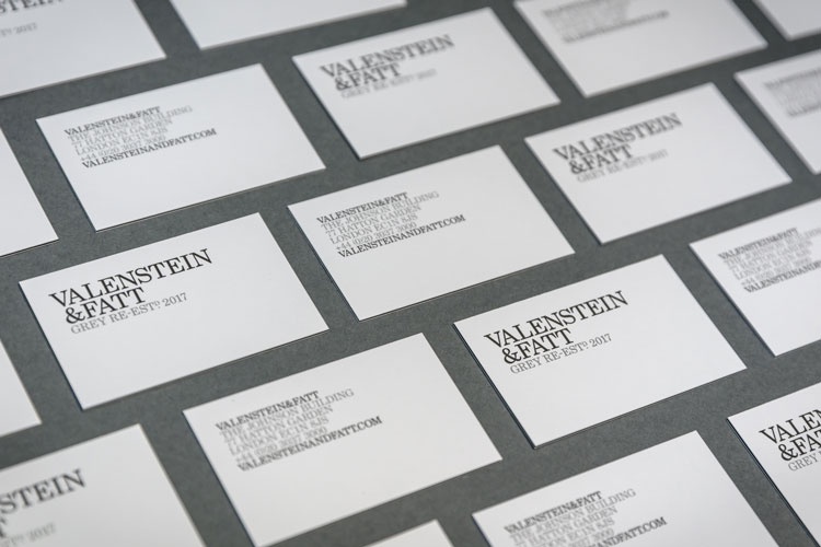
The new visual identity features a black and white colour palette and the agency has swapped its logo’s sans-serif typeface for a new logotype set in Century School. The typeface was originally designed in 1917 by a type foundry a few blocks away from the company’s first office in New York.
An installation of the Valenstein & Fatt logo made from solid concrete has also been incorporated into the agency’s Hatton Garden, London offices.