Firefox focuses on fire and drops the fox in new branding
The internet browser has launched a new visual identity, which looks to reflect how it has expanded into other online services such as file-sharing, password protection and email checks for data breaches.

Firefox has revealed its new logo of a circular flame symbol, after the free internet browser put two potential brand systems out to public scrutiny last year.
The browser is owned by software company Mozilla, which itself underwent a rebrand in 2016, where company staff and the public gave feedback on seven different brand concepts designed by UK studio, Johnson Banks.
The chosen concept, picked in 2017, incorporates the “://” symbols used in internet urls as the crux of the identity.
Mozilla then underwent a similar process to decide on the new branding for its browser, Firefox, last year, allowing the public to leave comments on a blog post about two suggested identities.
The two Firefox brand systems that were shortlisted included one centred around an abstract, diamond-shaped logo, created by an in-house design team and Hicks Design, and another centred around a circular, flame logo, created by Ramotion. These were the overarching brands, while a series of other icons were also created to fit into these identity systems and to represent different Firefox services.

The circular flame by Ramotion has now been chosen, but further refined since the concept was revealed last year.
Further icons have been designed as part of the identity to represent services such as the browser itself, encrypted file sending, password protection, and email monitoring systems to check for data breaches.
The new system aims to represent Firefox’s “entire family of products”, says the company, and “support its evolving product line” beyond the internet browser.
For this reason, the previous, overarching Firefox brand of a flame-cum-fox symbol set against a blue globe has been ditched, with the fox retained only within the icon for the browser specifically.
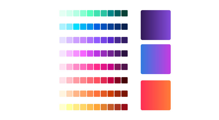
A new, expanded colour palette incorporates a gradient across orange, red, purple, blue and green, and the shapes now used across the icons have also been used to create background patterns, illustrations and motion graphics.
A new, sans-serif typeface has been incorporated for product names, which sit under each individual icon, chosen for its “modern” quality and “rounded feel” that aims to reflect the rounded shape of the icons, says Firefox.
The final identity has taken 18 months to develop, with contribution from Johnson Banks, Hicks Design, Ramotion, Firefox’s in-house design team and public feedback.
Collaborating with the public on the Mozilla and Firefox rebrands is in keeping with the company’s open-source ethos, given that its software is free for anyone to download and use.

Read this next


Nice article! Will wait for more