5 important things that happened in design this week
The BBC unveiled its own typeface, the Beazley Designs of the Year shortlist was announced and we looked back at 25 years of design in the Premier League – the news from the last seven days.
Thomas Heatherwick’s Garden Bridge design was scrapped

A £200 million proposal to build a tree and shrubbery covered bridge on the River Thames in Central London was abandoned this week, following months of setbacks for the project.
The future of the Thomas Heatherwick-designed Garden Bridge, which was first granted planning permission in 2014, was called into doubt following a report by Dame Margaret Hodge in April.
In the report, Hodge suggested that the cost to the taxpayer of building the bridge would be “difficult to justify”. It highlighted an escalation in costs from £60-200 million, and identified a funding gap of £70 million.
Following Mayor of London Sadiq Khan’s assertion that the £70 million shortfall would not be made up by public money, The Garden Bridge Trust chairman Lord David Abersoch has now revealed it is pulling the plug on the proposal.
In a letter to Khan, Abersoch criticised the Mayor’s Office for its lack of communication, adding: “It is now plain we cannot expect the level of support we need from you to deliver this landmark project.”
Khan responded by reiterating the validity of the Hodge review, and adding that taxpayers should be “very angry” that “tens of millions of pounds” of their money has now been wasted.
The BBC unveiled a new, bespoke typeface
The BBC revealed plans to ditch traditional typefaces such as Arial, Gill Sans and Helvetica across its websites and TV channels this week, replacing them with its own, bespoke typeface BBC Reith.
Named after the BBC’s founder Lord John Reith, the typeface has been designed by the media organisation’s in-house user experience and design (UX&D) team in collaboration with type foundry Dalton Maag.
The typeface aims to be “beautiful” and “more versatile”, said creative director David Bailey, with varying stroke widths between different letters allowing for “more breathing space” and greater legibility.
The organisation said it is also aiming to save money, as it will no longer need to pay the licence fee to use external typefaces.
The typeface has launched as part of a wider rebrand of BBC Sport by BBC Creative and Studio Output. The new identity features an updated logo using BBC Reith, a brighter colour palette and an updated, modular website design.
BBC Reith will roll out across BBC channels, websites and social media over the next year.
The Design Museum unveiled the best designs from the last year

The shortlist was revealed for the Design Museum’s annual Beazley Designs of the Year this week, encompassing the best digital; graphics; product; transport; architecture; and fashion design projects from the last 12 months.
The 62 nominees spanned topical issues and themes such as the refugee crisis and activism, and included a search and rescue drone used to help refugees stuck at sea, and a pink “Pussyhat” worn by protestors at the anti-Trump women’s march earlier this year.
Other featured designs included Smörgåsbord Studio’s national brand identity for Wales and augmented reality (AR) mobile gaming app phenomenon Pokémon Go.
All of the designs will go on display at the Design Museum, West London from 18 October 2017, while a winner for each category and one overall winner will be revealed on 25 January 2018.
Find out more info about the awards here.
We celebrated 25 years of the Premier League and football design

The English Premier League turned 25 this week, and to mark the occasion we looked back at the role design has played in the beautiful game over the years.
In recent times, this has included everything from DesignStudio’s rebrand of the Premier League in 2016 to DixonBaxi’s work bringing the new identity to life on-screen.
In light of the league’s 25th anniversary, we also spoke to designers about their favourite football-related designs from its history.
Johnson Banks designer Leanne Kitchen cited the “cut-out photography”, “dodgy Nineties hairdos” and “thick moustaches” seen on Merlin’s 1998 Premier League official football sticker collection as her personal favourite, while The Chase’s creative director Richard Scholey opted for the colourful graphics seen on goalkeeping kits.
“Why anybody would think these look good is another question, but I would imagine taking a penalty against anyone wearing one would have made your eyes water; maybe that was the plan,” Scholey added.
Read more of our most recent content about design and football here.
Eduardo Paolozzi’s tube mosaic designs went up for auction
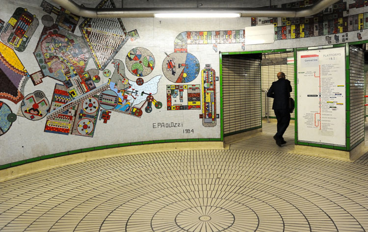
Scottish artist Eduardo Paolozzi’s print designs for his now iconic mosaics at Tottenham Court Road tube station went up for auction this week.
The colourful mosaic designs, which feature symbols and pictograms depicting the “cultural diversity of London”, were expected to go for £20,000-£30,000 each at Lyon & Turnbull auctioneers in Paolozzi’s hometown of Edinburgh.
The mosaics were originally commissioned by London Transport in 1979 and installed at Tottenham Court Road tube station in 1986, but some of them were removed and dismantled in 2015 when the station underwent reconstruction.
Over 8,000 people signed an online petition to save the artworks, and they were later restored at Edinburgh University.
The Contemporary and Post-War Art auction took place on 17 August at 33 Broughton Place, Edinburgh EH1 3RR. It has not yet been revealed how much the designs went for.
Read this next
-
Post a comment


