Lee Fasciani: The static logo is done — it’s all about animation
The co-founder and creative director at Territory Projects discusses why designers should be using technology to bring brands to life, from movement and interactive touchscreens to virtual and augmented reality.

As our communication channels become focused on screens and expand into new digital platforms such as virtual and augmented reality, there is an increasing opportunity to enrich brand identities with movement, dimensions and function, expressing far more than has traditionally been possible.
Free from the limitations of the static and two-dimensional (2D) forms, kinetic identities allow designers to create a sense of personality, emotion, attitude and intelligence within the very symbol synonymous with a brand.
Animation
Animated logos are nothing new. Seen in the film and TV world for more than 50 years, logo idents combined brand, entertainment and technology to distinguish companies. Today we see animated logos on web and app start-up pages all the time and they have shaped our expectations of what moving logos can do for a brand.
Think of Google, Airbnb, Spotify, Skype, and most recently Uber and Slack’s logo animations. While all are undoubtedly more professional brand systems than the previous identities, they still retain the playful elements and product vision that characterised the brands as start-ups.

Uber’s simple and elegant logo animation – a collaboration between Wolff Olins and the in-house team at Uber – serves to reinforce the idea of a “journey” – getting you where you want to go, quickly and easily. As the sans-serif letterforms animate, revealing curves and straights, the allusion to road map and junction becomes a living expression of the company’s purpose.
The use of movement to express the brand purpose is also used in Slack’s new logo to illustrate product vision. The collaborative platform relies on conversations organised by topic and the graphic elements – speech bubbles and lozenges – of the new identity animate to convey a sense of connected conversations. Still colourful and playful, it’s now also far more unique.
As animated logos have pushed the limits of expression, digital technology now makes it possible for brands to create truly interactive identities, adding exciting new dimensionality into logo design. The Ollo and Oi logos illustrate designs that take advantage of the flexibility of digital platforms, and stand out as great examples of the potential of living logos to increase brand impact.

Biblioteque’s responsive identity for Ollo, a broadband service provider, exploits the multi-touch function of smartphones and tablets and demonstrates how playful interaction can create a uniquely gaming-style brand experience that increases engagement and connection with customers. Using the brand colours and core logo, consumers are able to create their own logo by swishing and swiping on-screen, distorting the shape of existing Ollo mark.
Similarly, Wolff Olins’ interactive logo for South American telecoms company Oi, is an experiment into how logos can become more expressive with new tech. In this case, voice interaction transforms a user shouting ‘Oi!’ into a responsive graphic – a visual reflection of the impact that conversations can have.
Spatial dimensions
The extension of logos into three dimensions (3D) is still relatively rare in the digital space, but when done well, it can improve expression far beyond what is possible in 2D. Two great examples are the Freeview and IBM Watson logos, which both take full advantage of the potential of 3D.
Designed by DixonBaxi, Freeview’s logo was transformed as part of a new brand strategy for the UK-specific terrestrial TV platform. Intended to be contemporary and energetic, the animated logo begins with an electric flash, that draws an angled letterform that seems suspended in a 3D space. Expressive of the spirit of the brand, vibrant colours and bold form convey movement and energy that is difficult to achieve in a flat, static design.
IBM Watson’s pulsing 3D “avatar”, as this logo is referred to, was unveiled in 2016. A collaboration between IBM Experience and Design, led by (ex-Wolff Olins) vice president Todd Simmons, Athletics New York and Universal Everything, this simplified and modernised version of the original logo is a dynamic reflection of Watson Illuminates– the theme at the heart of the product. Intended as a “personification of artificial intelligence” the motion of the circular forms take full advantage of 3D, bringing depth and life to notions of connectivity, neural networks and intelligence.
Both of these logos have achieved a spatial dimension that enables greater expression of brand essence than traditionally seen in brand design. And it begs the question of why contemporary digital-first brands take their cues from the 2D tradition of print when motion graphic branding for film and TV offers richer, more interesting possibilities that align with digital?
AR and VR
Beyond 3D and interactive logos on web and apps, AR and VR platforms introduce the possibility of working in four dimensions (4D), extending the potential of identities for multi-platform brands. The possibility to physically interact with a logo as it were a tangible object or product could be game-changing.
With emerging opportunities in AR and VR, clients should think beyond 2D and 3D forms, to the potential of experiential logos.
AR and VR offer opportunities to design logos with a sense of physicality. The science fiction world has given us a glimpse of this future in films such as Ready Player One; the technology is already here to make this a reality.
While AR and VR platforms are maturing, brand channels, consumer products and corporate platforms can experiment with kinetic logos as a way to express their brand’s attitude, ready to extend into 4D.
From established brands to start-ups, when clients ask us at Territory Projects to create identities, we take advantage of tech and digital platforms to express unique brand qualities. Biosay is our most recent brand identity, and we feel that it demonstrates the power of living logos in bringing a brand to life.
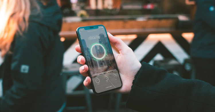
Biosay is an ambitious start-up with a wellness app that is soon to launch on the App Store. Using biometric smartphone tech, it goes far beyond conventional fitness and wellbeing trackers. Territory Projects worked closely with founder Rachael Donalds, her data scientists and developers, to articulate complex personalised data scores into a 3D graphic device, called a Bioji. A dynamic form, it uses colour, speed and movement to express an individual’s unique state of wellbeing. Adapting the Bioji’s visual expression for Biosay’s logo and an AR icon, we created a living symbol that seems to create a glowing energy.
A more expressive brand inevitably leads to a deeper emotional connection with consumers, as well as enabling a company to stand out more in its market. Clients and designers alike should be thinking about how they can use tech and interactive features to enhance the experience for users, boosting the brand’s profile in the process.
Read this next


Hmmmm, bit too similar for me:
https://heyhush.com/work/hush-made-by-numbers-data-sculpture/
‘The static logo is done’. It such an ill-informed, stupid statement.
I’ve been creating marks, logos, brand identifiers, symbols, colophons – whatever you want to call them – for over five decades. That’s a very long time and a lot of logos.
But my approach to designing them hasn’t changed one iota. A logo should be immediate, memorable and simple. It must be capable of surviving the crudest forms of reproduction. if it doesn’t do that then there will be trouble ahead.
If a logo is well thought out it can always be animated successfully. Conversely, if an animated logo can’t work in a static form, then it is a badly thought out piece of work. Rather like Fasciani’s premise.
Well said Mike!
‘The static logo is done’…a newer version of ‘print is dead’…!
Completely disagree. I think many designers spend too much within their design bubbles to see what is actually going on in the real world and seem to be very out of touch. Yes, animated logos are becoming popular due to social media usage. A static logo will always exist and will never go away. Maybe for some designers due to their focus on other areas of graphics such as motion and graphics. Print designers will always need a good static logo that still conveys the message.