Designing a website to promote better mental health in the workplace
Thompson Brand Partners has worked with charities Mind and the Royal Foundation to design the Mental Health at Work website, a new resource for employers and employees.

A new website has launched which looks to be an “accessible” resource to learn about mental health, aimed at teaching employers how to address issues in their workplaces.
Mental Health at Work is an online platform designed by studio Thompson Brand Partners, which provide both business owners and employees alike with resources including podcasts, pdf documents, videos and print-out posters to help them deal with mental health issues, or promote support in the workplace.
For instance, some resources such as research-focused pdfs are for learning, while a poster could be stuck up in a workplace to promote best practice when helping people with mental health issues.
Nick Ramshaw, managing director at Thompson Brand Partners, says the main target audience of this project is SMEs (small and medium-sized businesses) of up to 250 employees, which often do not have the same resources at their disposal as bigger companies, such as large human resources (HR) departments.
However, the website is intended to be used by businesses of all sizes including large ones, which is why the design studio focused on a filtering tool for website users and splitting off sections of the website into categories for various audiences.

The website has been commissioned by mental health charities Mind and the Royal Foundation. According to Mind, one in six workers deals with a mental health problem such as anxiety, depression or stress, which can have an impact on their performance.
A website focusing on mental health is particularly prevalent for businesses in the creative industries, Ramshaw adds, as the “nature of the job” of a designer, such as having to work to deadlines and constantly come up with creative ideas, can “lead to considerable stress and anxiety”. A recent survey conducted by illustrator Ben O’Brien, otherwise known as Ben the Illustrator, found that four fifths of freelance illustrators live with problems such as anxiety and confidence issues.

The Mental Health at Work website features a directory section called “resources”, where users can search for different types of things such as policy and practice recommendations, factsheets, medical studies and training. They can also specify by region to see if it is available near them, and by format, such as in website, pdf, podcast or video form.
A “toolkits” section on the site groups together various different resources for more specific causes – for example, there is a “workplace stress” toolkit and one focusing on mental health in the voluntary sector, another for nurses, and another for small businesses.
A “case studies” and “blog” section provide wider reading around the topic of mental health in the workplace as well as real-life examples, while a “glossary” section provides employers with definitions of terms they may not understand.
On the homepage, there is a “get started” tool, which leads users through a series of questions and scenarios to help tailor a service and set of resources that is suited to them.

“The most unique bit of functionality on the site is that tool, which allows people to be guided through questions that help us present them with the most relevant resources,” says Chris Skelton, creative director at Thompson Brand Partners.
“Because people are nervous about this topic, they might not know what the right things to ask are, or they might be overwhelmed or struggling themselves,” he adds. “So we tried to create an easy, step-by-step tool with clear language.”
The website was created following four rounds of user-testing across five locations in the UK, where Thompson Brand Partners, Mind and The Royal Foundation worked with over 300 people, many of whom had experienced mental health issues themselves.
While the user experience (UX) design of the website aims to be intuitive, the graphic design aims to make it “accessible”, open and friendly to encourage people to use it in the first place, says Skelton.
This includes a lot of white space, a simple colour palette of black, white, navy, grey and teal, and the use of “soft” sans-serif typeface Basis, created by foundry Colophon, which aims to have high legibility and feel “welcoming and modern”, adds Skelton. The logo is set in an all-caps font of this typeface, and a secondary, highlight colour palette of bright green, yellow and red has been used.

Additionally, Thompson Brand Partners avoided using a lot of copy on the website, and added illustrations to emphasise “softness of approach”.
“This was a great way of being able to talk to people in all types of workplaces, without doing so specifically in the text copy,” says Skelton. “We show people sat a desk, queuing at a bus-stop, painting – dropping these illustrations in helps it appeal to many sectors, and also softens the seriousness of the topic.”
Skelton adds that the studio wanted to avoid the website feeling too “clinical and cold”, so swapped out a lot of navy and blue tones used initially, for the “warmer” teal colour.
The new website will be promoted and awareness will be raised via Mind, which has connections with public and private sector businesses, with large corporates such as Lloyds Bank, Virgin and Barclays currently on board to encourage the use of Mental Health at Work.
“The direct aim is at employers, who have the power to make change,” says Skelton. “But it’s also an online learning platform for employees. We want this to be accessible to anyone, and give people the confidence to start talking about mental health in the workplace more.”
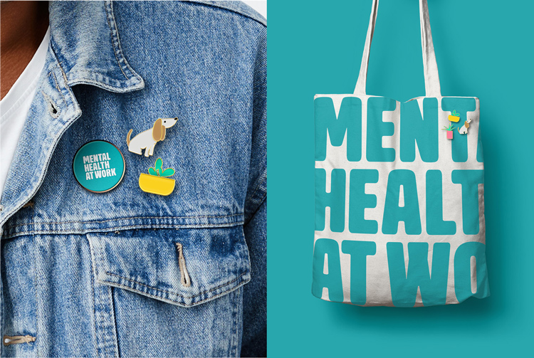
Mental Health at Work is now live. A wider brand marketing campaign to promote the new website has also launched, and is currently rolling out across merchandise such as tote bags, stationery and badges, t-shirts, and print materials such as posters.
Read this next


Love the illustrations. The colours and typography are to close to the national ‘One you’ campaign mind. I’m guessing its in association with the Department of Health somehow.