
As cryptocurrency grows up designers are helping brands reach the mainstream
Cryptocurrency, not traditionally a design-led sector, now poses plenty of opportunities and challenges for studios.
One of the most recognisable pieces of cryptocurrency design is shrouded in mystery. The orange Bitcoin logo – a play on traditional currency – was created by the decentralised digital currency’s founder Satoshi Nakamoto. Since Bitcoin’s establishment in 2009, the double-striped B logo has become synonymous with the world of cryptocurrency. But while the underground niche has grown into a headline-grabbing industry, Nakamoto’s identity has remained unknown. It’s not even clear if it’s one person or a group.
The uncertainty surrounding Nakamoto may have helped with the industry’s initial allure, according to Koto creative director Tim Williams. “It’s kind of legendary,” he says. “There’s a sense of heritage even it’s really short in terms of how long it’s been around.”

In the early days of cryptocurrency, the simplicity of the Bitcoin logo – refined just once in over a decade – was effective. “Playing on what people were used to has probably helped it grow,” Williams says, noting its similarity to traditional currency icons like the euro or British pound. “I don’t think it’s overthought,” he says. “It just felt like a very simple evolution of what money is and how it moves in a digital world.”
While effective, these early visuals had design limitations. “There’s no real brand attached to it,” Williams adds, “so there’s not much for people to work on.” This has led to a wider lack of imagination when it comes to cryptocurrency branding. “What you see in the media is people smacking that symbol onto a coin, because it’s something people can relate to,” the designer says.
“No-one’s really done anything remarkable in the space yet”

In the last decade, the sector has exploded with new currencies, trading platforms and companies like Ripe which uses blockchain to disrupt traditional fields such as farming. “No-one’s really done anything remarkable in the space yet,” Williams says. While it may have a very different aesthetic to Bitcoin, Ethereum’s branding – incorporating comic book and sci-fi visuals – is still “familiar for the public”, Williams says. This is echoed in crypto networks, whose identities are often “very literal”, he adds, frequently relying on blocks and isometric drawings.
Earlier this year, Koto announced that it would be rebranding blockchain network Polkadot. Williams believes that understanding the ideals of early innovators is central in the design approach. “Decentralising the internet is the mission,” he says, as well as “democratising our freedom”. That’s not always been at the forefront of people’s perception of cryptocurrency, according to the designer. It can sometimes be viewed as a purely money-making mission, for instance. “It’s about how we can reshape the world,” Williams adds.

This understanding will be important to how brands develop. He adds that it won’t feel “static” and will be influenced by the passionate communities surrounding them. “What’s interesting is not creating a brand that’s consistent for decades,” Williams says. “It’s going to really grow and move in the direction of the community.” While the rebrand for Polkadot has not yet been revealed, Koto did explain how the work would be a collaboration with the community.
Williams says that the question that Koto is asking is: “How do you represent a cultural movement?” “There are interesting parallels to think about in the community world of blockchain and cultural movements that have global adoption,” he says, pointing to Extinction Rebellion and the punk movement. Some of the relevant symbolism includes currencies, flags, monarchs, food and music. “All these things help to build a national identity”, he adds.
“People are starting to call branding agencies”
Koto strategy director Tom Moloney says that “more discerning choices” are being made as people grow more familiar with cryptocurrency. “People are starting to call branding agencies” to sharpen their offerings, he says. It’s no longer just about explaining what cryptocurrency is, but about the sector’s nuances.
In some territories, Bitcoin has been popular because the domestic fiat currency is more volatile, Moloney explains. In Europe and America where there’s more economic stability, he suggests that some investment could be driven by people’s fear of missing out (FOMO). “It’s a really dynamic background to be communicating in.” It’s similar to how financials apps are appealing to younger audiences by offering more ethical investment opportunities.
One challenge for designers will be gauging access points for potential audiences. “There’s a level of complexity and knowledge you need to truly understand it,” Moloney says. “But how much do you simplify it?” If it’s not clear enough, you might drive away casual investors, but too much could risk the sector appearing “disingenuous”, he says. “It’s almost like you’re masking something.”
“Design has a vital role to play”

Alphabet co-founder Sam Lane echoes Moloney’s views. “As crypto is still relatively new in the grand scheme of things, most of the brands were start-ups, with little to no budget for design in the early years,” Lane says. But as the sector has gained traction, budgets for design and marketing have increased. Lane points to the original Google logo in the 1990s and the contemporary version as a comparison. “It’s a more obvious example of how a brand has transformed and developed positively over time,” he says.
Design is “absolutely key” for the sector, Lane adds. Last year, Alphabet designed the identity for trading platform Coindirect, which sought to make cryptocurrency “more accessible to everyday people”. The work includes 3D animations which represent the workings of crypto trading. “Design is a visual language and has a vital role to play in simplifying and explaining how cryptocurrency works,” Lane says, “especially to the more entry-level audiences who may be bamboozled by charts and graphs.”

When it came to redesigning Coindirect, the studio sought to avoid sector tropes. “The biggest cliché was the classic coin visual,” Lane says. “Although this kind of visual makes it immediately clear what the subject and product is, we felt it was a bit soulless and overdone,” he adds. Other common visuals included “endless screenshots of the UI and in particular graphs that most entry-level investors just didn’t understand”.
Alphabet instead took cues from lifestyle brands in its attempt to appeal to a wider audience, explains Lane. Natural reportage photography was introduced to show that “crypto can be for everybody,” the designer says. “It’s not something that’s just for businessmen or internet geeks.”
Designing a “more inclusive space”

Crypto brands no longer just include the trading platforms but apps working in a social space, which have incorporated some of the movement’s founding ideals. One of these is Murmur which aims to create a censorship-free social media platform that runs on blockchain technology. The app’s rebrand – by consultancy Motto – looked to “legitimise” its offering, says studio co-founder Ashleigh Hansberger.
“Blockchain is confusing,” she says, adding that early branding for Murmur was “very ad hoc”. Part of the studio’s mission was to “create a brand to build more trust and to earn a better reputation”, the designer explains. The rebrand centred on the idea of being rewarded for social interactions – on the app, users receive crypto rewards for sparking discussions, which range from politics to music to culture.
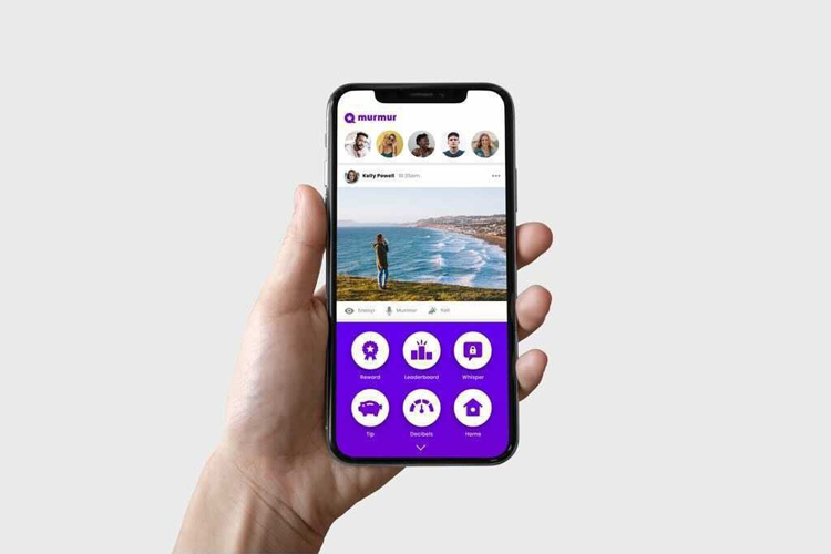
Integral to that was simplifying the offering, the team explains, especially important in an increasingly crowded landscape. The “pretty literal” logo uses a speech bubble and star icon to reinforce the social reward side of the app, for example. The new identity highlights another potential evolution for cryptocurrency into what Hansberger calls a “more inclusive space”. The gender balance of users was 84.6% male, while a third of its audience was based in Asia, a quarter in Europe and just over 10% in North America. “There were mostly white, middle aged men on the platform,” Hansberger says. “The design language tries to get beyond that and legitimise Murmur.”
The colour palette is now “playful and bright and appealing”, while a softer typeface hopes to “make the identity friendly”, Hansberger explains. “Professionalising the brand was all about attracting users beyond the early adopters and feel like a more inclusive community,” she adds. The designer hopes that the brand now resonates with people from more diverse backgrounds and women. Koto’s Tim Williams suggests that some of the sector’s male-centric branding could be a hangover from the financial world which “has been historically controlled by men”.
“Branding the unknown”

Motto co-founder Sunny Bonnell does note that Murmur users all identified with “always being online”. “Their lives were busy and professional, but they’re online from dawn to dusk,” she says. As cryptocurrency continues to appeal to professionals in an online world, branding will play a big part, she believes.
Bonnell compares it to the rise of online banking, led by payment platforms like Stripe and Paypal. “Online banking was a new world and a scary one for many people,” she says, “and it always feels like shaky ground when you’re trying to adopt a new platform.” That’s especially true when it comes to currencies, which have existed for centuries. “What you’re seeing is something seen as a hoax or a joke being taken very seriously,” she adds. As the sector’s design legacy shows, this can be a complicated journey, though all the designers suggest that it’s an exciting one too.
“Agencies will get better at branding the unknown,” Bonnell says. “Someone will lean forward and do a beautiful job and everybody will look to it and say ‘I want to be that’.”
Read this next

-
Post a comment


