General election 2017: a look at UK political campaign designs
In light of the election set to take place next month, we look at how the main political parties are attempting to win over voters through their branding and campaigns.

Since prime minister Theresa May called a snap general election last month, the UK’s political parties have been ramping up last-minute campaign efforts to win over voters and deliver manifestos.
The decision was surprising to politicians and public alike, given that May had previously pledged not to call an early election before 2020.
May announced the news on 18 April, and with the election set for 8 June, this has given parties less than two months to put together and deliver their pledges. This is significantly less than the official campaign period for the 2015 election, which ran for roughly five months.
The rushed election appears to be in the Conservative Party’s favour, as May is currently leading the public opinion polls by a long stretch, while her biggest rival and leader of the Labour party Jeremy Corbyn is trailing behind. YouGov’s most recent results show that 49% would trust May as the best option for prime minister, while 21% think this of Corbyn.
Public opinion has almost certainly swayed the parties’ visual campaigns, too. The Conservative Party has played on the popularity of their leader through adopting a US-inspired, “personality politics” campaign, which centres around May’s name rather than the party’s. Labour however, has opted to retain its party’s name.
Design Week looks at the main parties’ campaigns, and how they are portraying themselves in the run-up to 8 June.
The Conservative Party

In a similar style to recent US presidential election campaigns, The Conservative Party has opted to lead on May. The prime minister has addressed supporters at several stops on her campaign trail with posters that read: “Theresa May: strong, stable leadership in the national interest”. A bold, sans-serif, all-capitals typeface is used alongside a small colour palette of navy blue, light blue and white, which has long been associated with the Conservatives. The party name and its Union Jack-filled tree logo are either relegated to the bottom of posters set in a small size, or left out altogether. The same trend can be seen of the Conservatives’ online store product range.
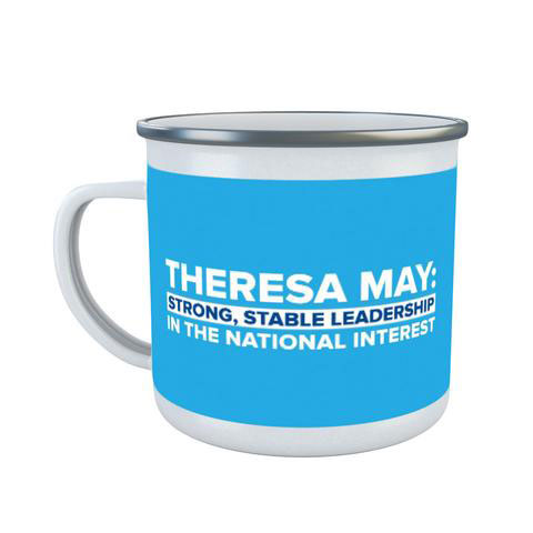
May’s popularity with the public has almost certainly impacted the design of the party’s campaign materials, while her penchant for emotive, descriptive language – surely everybody now associates the words “strong” and “stable” with the leader – has made it on there, too.
The emphasis on stability is exaggerated through the simplicity and consistency of the design, which is devoid of extraneous imagery and could be easily adapted to take on the party’s, or a local MP’s, name if need be.
Chomoi Picho-Owiny, creative director at consultancy Blue State Digital, which has previously worked on political campaigns for the Labour Party and Barack Obama, says that individuals are becoming increasingly important in UK politics, which must then be reflected through design.
“Personality politics is simply politics today,” he says. “May’s campaign has taken a page from Obama’s playbook. Campaign strategists calculate the value of party popularity vs. the strength of the candidate. When it’s done with simplicity and determination, it projects confidence and boldness. The cult of celebrity was once the preserve of the TV, film and music industries, but this tactic has moved firmly into mainstream politics.”
It is surprising that May’s tendency to retract promises and opinions – her pledge not to call an early election and her prior anti-Brexit views being just two – has not impacted severely on the public’s opinion of her. Maybe this shows how effective repetitive slogans – “strong, stable leadership” – and consistency can be.
The Labour Party
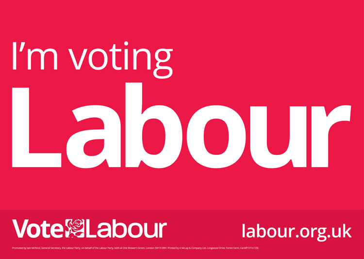
Labour has opted to lead with the party line, with the majority of its campaign posters and merchandise reading “vote Labour”. The party’s red and white colours have been used, while the typeface is a lowercase sans-serif that appears softer and less brash than the Conservatives’ uppercase. The party’s rose logo and website is reiterated at the bottom of posters and merchandise.

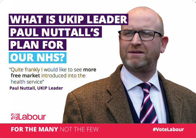
Leaflets feature a mix of illustrations, photography of Corbyn and pledges in the form of quotes, but the leader’s name is not brandished boldly in the same way as May’s, perhaps in an attempt to take attention away from Corbyn, who is trailing in the opinion polls. Some leaflets criticise ring-wing parties, and take on the colours associated with the Conservatives (blue) and the UK Independence Party (UKIP) (purple) when doing so.
While some of Labour’s campaign merchandise is consistent and simple in a similar style to the Conservatives, the party uses a more imaginative range of imagery to place greater emphasis on the general public rather than the leader. Recognisable, everyday cues, such as photography of police officers, illustrations of motorway signs and leaflets in the shape and design of National Rail train tickets, convey the party as ordinary and relatable. Picho-Owiny at Blue State Digital says that, increasingly, political parties have to “modernise and refresh” their design systems and “open them up for supporters…to make the party their own”.

But he also says they need to “push for brand consistency”. Could a wide range of styles and graphics be confusing for voters? It’s possible that using other parties’ colours on leaflets to talk down opponents could, at a quick glance, promote them instead.
Radio 4 journalist John Humphrys has questioned whether the recent leak of Labour’s draft manifesto document, presumably from within, will lead to the public thinking the party “shambolic as it is divided” or whether it will soon be overshadowed by another party’s blip in the news. In a similar way, it’s hard to know whether Labour’s campaign style will be perceived as untidy and cluttered, or more appealing for its human qualities.
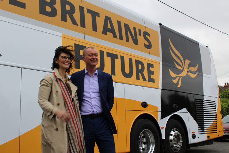
The Liberal Democrats
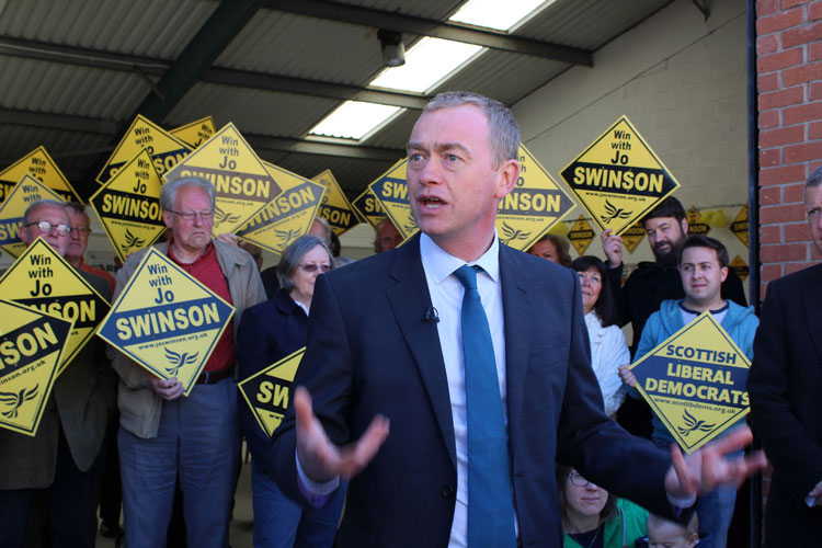
Consistency is key to The Liberal Democrats’ campaign; brand colours of yellow and black are present across all material, from posters through to its battle bus. There is some use of orange, too, which could be an attempt by the party to “own” both shades. The Scottish National Party also uses yellow.
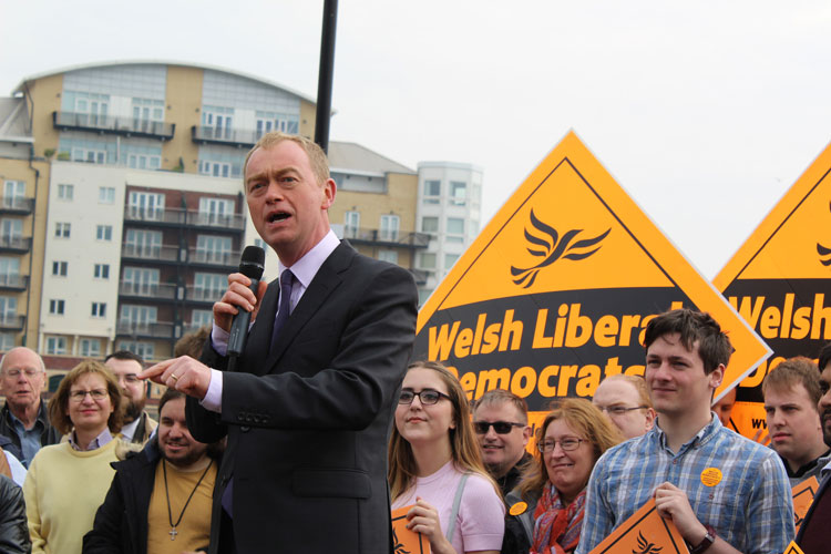
The party’s emblem, the “bird of liberty” – famously designed by the late Rodney Fitch – is a proud element of its campaign graphics, while the diamond-shaped posters are a point of difference among Conservative and Labour posters. The black strip across the middle of the diamond is an adaptable placeholder, which allows local MPs and different countries to take over the branding easily.
An in-house team has created the designs, which are going for heritage rather than policy or personality. A spokesperson at the party says the brand “has been associated with yellow for many years”, and its diamond-shaped posters are “famous”.
The Liberal Democrats are currently third in opinion polls, with 11% of voters intending to vote for them. The traditional designs could be an attempt to restore authority for the brand, after the party suffered following the 2015 election, when 49 MPs lost their seats in Parliament.
UK Independence Party (UKIP)

The UK Independence Party floated the idea of a rebrand prior to the snap general election being announced, later confirming that this would not take place in time for the 2017 election.
So while UKIP retains its purple and yellow colours and pound sign logo within its campaign, party leader Paul Nuttall has confirmed the need for the party to “modernise”.
In changing the logo, this could attempt to move away from the image of UKIP as immigration-led, which was cemented by former leader Nigel Farage. His views around race and immigration were controversial and divisive, causing pro-Brexit Conservatives to cut UKIP out of the Leave campaign.
Elements of this need for change came across in UKIP’s posters at Nuttall’s campaign launch. They brandish the party colours and logo but also include the words “#BritainTogether” – a sign that the party may want to move towards being perceived as more tolerant and inclusive, but at the same time, retain its nationalist, Britain-first stance.
Aside from a few posters, UKIP campaign materials are scarce. Perhaps the party will begin to pay more attention to visual communications once it rebrands at the end of the year. But a new logo will not be enough to change perceptions on its own, says Picho-Owiny at Blue State Digital. “In a time when people are sick of political parties and increasingly distrustful of institutions, brand strategies have to go further than simply updating a logo,” he says.
The Green Party

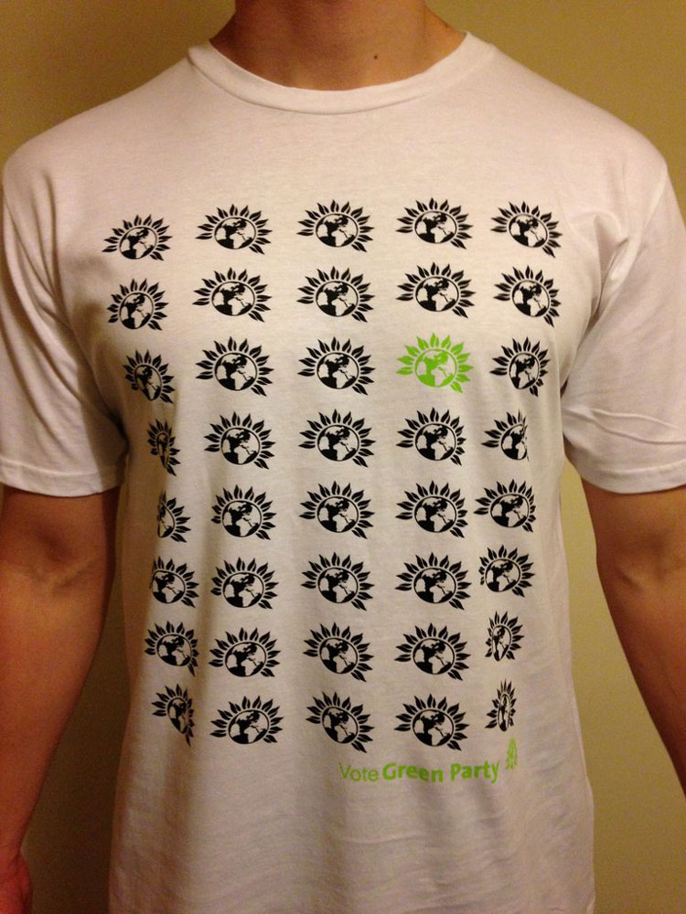
The Green Party takes a more inventive and left field approach to campaign design. While it retains some traditional posters in light green, dark green and white simply stating “Vote Green”, the party has a range of tongue-in-cheek, illustrated products that either convey its policies or customise the distinctive, globe-sunflower logo.
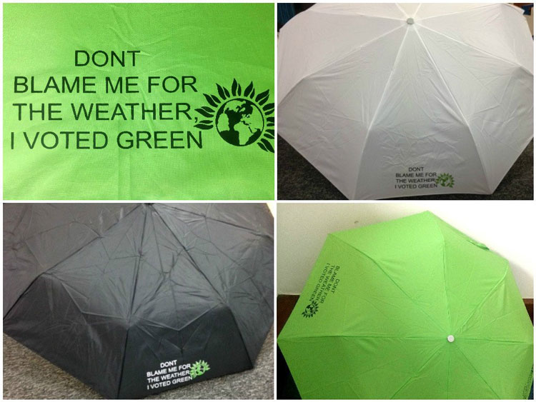
This includes green umbrellas printed with slogans such as “Don’t blame me for the weather, I voted Green”, and t-shirts which feature multiple copies of the party’s logo in black, with just one in green, implying the wearer’s individuality in voting for the party.
These are coupled with campaign materials covered in hard-hitting slogans such as “Carbon cuts not job cuts” in a brasher, all-capitals, black typeface. The difference in design shows the party’s aim to connect with its supporters but also be taken seriously, and remain adamant of its strong, left-wing views.

This versatility can be a useful tool in engaging voters, says Picho-Owiny at Blue State Digital. “A political campaign or brand is most effective when supporters want to appropriate, customise and celebrate your brand,” he says. But with such a varied design system, it may be the parties’ with simpler design systems, such as the Conservatives and Liberal Democrats, who see more voters interpreting campaigns in their own way.
The Scottish National Party (SNP)
Scottish party The SNP has taken a similar campaign design stance to Labour; it stays consistent with its yellow and black colour palette, its ribbon-shaped “clootie” logo and core typeface Sensibility, but has adapted campaign materials with colourful, animated illustrations depicting the party’s policies.
The campaign has been created by a combination of in-house designers and external studios, and aims to be “adapted in terms of message, medium and style” for different audiences, says a strategist at the SNP, Ross Colquhoun. He adds that design is an important aspect of the party’s campaign, it that it helps to “distill complex political messaging” into something “memorable for voters”.
The brand’s ribbon-shaped emblem – which aims to represent the cross of a Scottish flag, a thistle and a Scottish pudding called a clootie dumpling – was designed by Julian Gibb in the 1960s, and remains an integral part of the party’s campaign branding today.
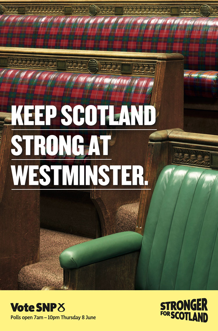
In a similar tactic to Labour, the SNP has additional marketing set in blue, which disparages the Conservatives. However, in a similar tone to the Conservatives’ “strong and stable” slogan, it takes on “Keep Scotland strong at Westminster”. This could be a direct jibe at the party, which, while still 20 points behind the SNP in opinion polls for Scotland, has replaced Labour as Scotland’s second most popular party.
With less than a month to go before the general election, political parties are going to be trying their hardest to rally up votes, whether that’s an attempt to secure a majority or just win back lost public appeal. It remains to be seen if design will have an impact on electability; but the fact that more thought and consideration is going into visual communications, whether that’s through consistent, personality-led posters or eclectic, animated gifs, shows that it is becoming a bigger part of UK political campaign trails.
All six political parties were contacted for comment.
Read this next


Some slightly dodgy leading on the Labour poster (fourth line down). It just goes to show how quickly the campaigns have been created!
Yes, and the Green Party are struggling with the kerning of their own name.
And also forgot the apostrophe in DON’T on their umbrella design too. That text looks like it was set in 20 seconds in MS Word and almost clashes with the logo. I’d hope that no-one calling themselves a designer was involved in that item!