
The Guardian redesigns its Daily app to offer a “curated” experience
The app’s update is inspired by streaming services like Apple Music and Netflix.
The Guardian has redesigned its Daily app for an “enhanced reading experience” that aims to provide readers with a more “curated” version of the newspaper’s content.
Unlike the Guardian’s website and Live app, which are updated throughout the day, stories for the Daily edition will be chosen by editors and published once a day at 3:00 BST. All the content is available to download for offline reading.
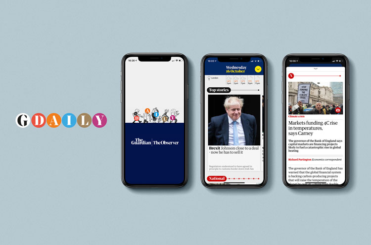
One of the biggest changes from the current edition of the Daily app — available across iOS and androids, and on tablets and phones — is the categorisation.
This was inspired by internal research at the paper – including analysis of user navigation – which resulted in content being divided into more intuitive terms for readers.
Alex Breuer, executive creative director at the Guardian, says the app took a similar lead in becoming more reader-orientated. It is split into eight “pillars”; Top Stories, National, World, Financial, Journal, Culture, Life and Sport.
“In a matter of seconds, you can get an overview of what we have curated as the most important stories in news or in culture or in lifestyle,” Breuer says.
Restructure

The user interface (UI) is pared back; there’s no video, sound, or interactive graphics. When you click on an image, you simply get the caption.
Breuer says this simplicity is intentional: “We were wary of complexity for complexity’s sake.”
This reader-centred approach resulted in a range of design details, some inspired by interfaces of apps that were not journalistic, such as music and television streaming services.
With the challenge of dealing with so much content, Breuer says that he was particularly inspired by Netflix and Apple Music, which have a “similar challenge” in presenting a vast amount of content to users.
As well as the new categories, at the top of each section are “little sliders” which have a “lozenge-type” button that slides along when you swipe through articles.
Breuer says: “Each of those dots corresponds to a panel of content and what we’re trying to show with this is that there is a finite amount of journalism.
“Unlike the website where there are thousands of articles, this is a manageable moment of the most important stories that we have published.”
Breuer says that the sliders have proven successful during the testing stage, as it “shows there’s an end before you get there”. “That’s simple and powerful”, he adds.
The reader is in control
This sense of the “reader being in control” emerges in other details. When you select an article for example, it comes up as a “tray” rather than filling the whole screen.
“We wanted to feel that when you go into an article, it was a quick swipe to get rid of it,” Breuer adds.
The vertical scrolling through sections, and left-to-right swiping of individual articles was aimed at readers who would want to know the key stories and those who wanted to go more in-depth into each section.
“We saw that first screen as a light overview of everything for people who might want the information more quickly, and simply through the UI — of swiping right — you can get deeper into any section,” Breuer says.
“What defines this product is the day of the week”
The Daily app is distinct from both the paper’s webpage and Live app. This created “interesting design challenges,” according to Breuer.
For example, for the weekend edition of the app, sections “preserve the journalistic content” but do not have the same categories as the physical paper.
With Monday to Friday having a structure unique to the digital product, Breuer says it would have been “clumsy” to revert to the “print nomenclature on the weekend”.
What is called the ‘Review’ in Saturday’s physical paper — a section that covers culture and lifestyle — is split into more specific categories on the app, such as ‘Books’, ‘Culture’, and ‘Food’.
Branding played a key part in this design too. The only place where the Guardian’s name appears is on the app’s splash screen before the edition loads.
“Beyond that, there is no word for The Guardian,” Breuer says. “What defines this product is the day of the week.”
Future plans
Breuer says that his team is exploring customisation on the app. Some test users have “shown a desire to get to certain parts of the app quicker than others,” he says. Physical responses, such as vibration responses or sound notifications, are also absent from the current version of the app.
Breuer says that both these options might be in the pipeline for the app, but that the initial focus was to create a “functioning” piece of UI.
The app might also incorporate video, sound and interactive content in the future, but this again is not the current focus. The paper’s recent series on pollution had interactive features online, for example – such as a tool which allowed users to explore MPs’ records on climate votes.
“With a product like the Daily app, we hope it’s speed and simplicity which will draw people to it,” Breuer says.
The Guardian’s growth strategy

The Daily app’s redesign is the latest part of The Guardian’s growth strategy, outlined at the beginning of April 2019. As part of a three-year strategy, the paper set out to reach a goal of two million supporters.
Juliette Laborie, The Guardian’s director of digital reader revenues, says that this meant “quite significantly growing the reader revenue operations” which includes contributions as well as digital subscriptions, which the Daily app is now part of. US and Australian version of the app are planned for next year.
Last year, The Guardian Weekly was relaunched as a glossy news magazine in an attempt to appeal to a more global audience. In April 2019, The Guardian’s Sunday paper, The Observer also launched a biannual, print design magazine called Design.
Breuer began to overhaul the Guardian’s digital products in 2014 when a responsive website was launched and the digital design language rethought across platforms.


I have just seen your new app today. I think it is dreadful. I was faced with a screen on my iPad that I had to swipe across and down with everything in one messy collection. And as for doing any of the crosswords online, you have ruined that too. It is very difficult to find anything. I have now cancelled my subscription.
Fine on a phone but hopeless on an iPad. I thought I was alone in my verdict until I read your first comment and the comments on the Appstore. I hope the Guardian will re-think, but the execs’ self-satisfied statements in the article suggest not.
I was looking forward to the Guardian’s new app, but what a disappointment it’s proved to be. Cumbersome and slow to navigate, it’s easy to miss stories.
The contrast between the claims made by the Guardian’s digital director and the reality faced by the user is very stark indeed.
It’s worse than the previous app is almost all respects.
Minor improvements won’t solve the numerous problems, which appear to be the result of the basic design.
The new app needs to be scrapped and replaced by something much better.