
Studio Output gives Union Hand-Roasted Coffee radical new look
Circular arrows ditched in favour of high-end look and a “U”, which looks like a coffee cup.
Circular arrows ditched in favour of high-end look and a “U”, which looks like a coffee cup.

“He genuinely loves marijuana”, says Oberman of the US hip-hop star.

SomeOne’s Simon Manchipp looks at the mistakes consultancies make and how design business can hold on to clients long-term.
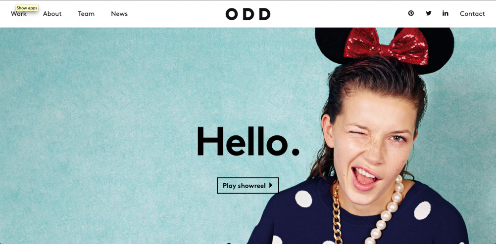
Tom Webster of The Future Factory looks at some of the best consultancy websites around and highlights what makes them successful.

The new identity, created by Futurebrand, comprises 72 balls – each one representing a club in the newly named EFL.

Unicef reveals details of wearables challenge to design “life-saving products” rather than the “nice-to-haves” that we tend to associate with the category.

DixonBaxi and Pentagram have worked on the new identity for the broadcaster.

DewGibbons+Partners has created a hand-painted logo for a Chilean pop-up dining experience, which is influenced by native Ona artwork.

Ive says: “There are clearly things you can do sketching and writing on the iPad which you could never dream of doing in the analogue world.”

With the winners of this year’s Design Week Awards set to be announced, we get insights and opinions from this year’s judging panel.

The 10 winning entries for MedTechSouthEast, a joint venture between the Design Council and MedCity, include a make-it-yourself walking aid, a glove to steady the hand of people with Parkinson’s

A new report from the Bank of America Merril Lynch forecasts a future where 35% of white collar jobs will be wiped out by automation in the UK, but do designers

As the design industry propelled itself forward, we were always there to champion, inform, analyse and guide the way.

Have you been paying attention for the last four decades? Only one way to find out.

Design Week closes, having championed design excellence for the past 38 years.

As part of our series on design in 2024, WeWantMore creative director Ruud Belmans offers his view on what retail and experience design might look like next year.