
Maserati reveals new logo to launch “modern” era
The Italian car company has revealed a new symbol, range of badges and wordmark as part of a “contemporary” restyling of the brand.
Italian car company Maserati has unveiled a new version of its trident logo as part of a new identity which will represent the brand’s latest era.
The updated identity includes a new version of the luxury brand’s logo, on-car badges as well as a refined wordmark.

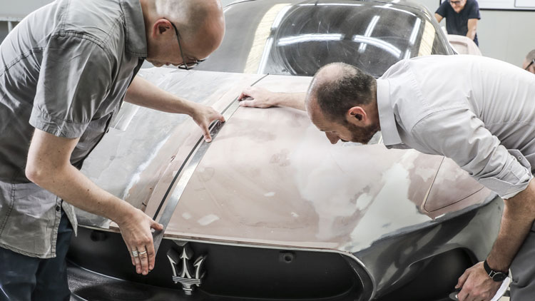
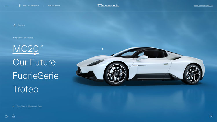
The new branding was revealed at the launch of the marque’s new sports car MC20, which had a digital launch in Modena.
The identity was designed in-house at the Maserati Centro Stile (the company’s design centre) in Turin, Italy.
A “more elegant” logo

Maserati says that the refreshed identity has “more modern, elegant, stylish graphics, while still conserving its history”.
One of the most noticeable changes for Maserati’s badge is the shift to a simpler colour palette. The previous design’s red has been removed and it now comprises only white and dark blue.
The blue “morphs into a very deep shade with a lacquered effect”, according to Maserati. The brand is calling this colour “Maserati Blue”.

The trident symbol has had a more subtle update. The arrows at the side have been rounded for “greater balance” and a smoother continuity between the upper and lower sections.
The distances between the trident and the background have been changed for a “more dynamic overall effect”, Maserati says.

The trident logo was originally designed by the company’s founder Mario Maserati. It was inspired by the fountain of Neptune in Bologna’s Piazza Maggiore and is a reference to the sea god’s strength. It’s also a nod to the company’s roots in Bologna, where it was founded in 1914.
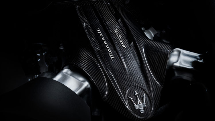
All the logos have been changed throughout the car, including on the steering-wheel, pillars, wheel caps and front grille.
A “high-tech effect”

The trident logo and Maserati script on the back of the car now have a “satiny” finish rather than a “glossy chrome finish”.
The brand hopes this gives it a more “high-tech effect that evokes polished aluminium”, which may be part of the brand’s digital considerations.

The pillar badge has also changed. It used to be enclosed in an oval with a lightning bolt running through it but these have been removed in a further move towards simplification.
The Maserati wordmark at the car’s rear has had a subtle update. It is “simpler and more modern” and will also be in use for all the brand’s future models.

A new era

The MC20 is the first Maserati to be painted at the company’s modernised “futuristic” plant, based in Modena. While this space has “innovative, environment-friendly technologies”, there is still a focus on the past.
The colours, for example, have been based on the Maserati’s legacy. A red shade, evocative of the “explosive power of a volcano”, is a reference to the Tipo 26, the first racing Maserati in history.
In this way, Maserati — like Pentagram’s recently-launched Rolls-Royce rebrand — appears to be striking a balance between its luxury past and a more modern future.
The past year has seen a spate of automotive rebrands. BMW, Toyota, Nissan all updated their identities, while VW also revealed its own rebrand last year. There has been a trend towards a “flatter” design, which is more suited to digital applications.
“We approached them as celebrations”
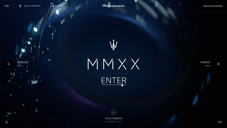
In keeping with the more modern aspects of the branding, Maserati had a virtual launch for the MC20. Thousands of online Maserati fans were invited to stream an event dubbed “MMXX” which was held at the Autodromo di Modena race track.
It was organised by Amsterdam-based digital consultancy Resn, which previously organised the launch of a new model from electric bike company VanMoof.
The specially-built exhibition allowed for virtual interaction, with custom Maserati reaction icons and live commenting. The physical event was socially-distanced.
“We didn’t approach these events as simple product launches,” Resn managing director Rik Campbell says. “We approached them as celebrations.”


The New trident looks great, the new word mark, quite nice. But then put it in a generic oval with a different word mark on the bonnet. Why? Very confusing!
Just read this article based on the new SKODA mark; Agree: implementation is inconsistent and uninspiring. There are applications with a circle, oval and no control shape at all. Very confusing and disappointing.